UI Guide #
These are the guidelines for developing UI in Penpot, including the design system.
React & Rumext #
The UI in Penpot uses React v18 , with the help of rumext for providing Clojure bindings. See Rumext's User Guide to learn how to create React components with Clojure.
General guidelines #
We want to hold our UI code to the same quality standards of the rest of the codebase. In practice, this means:
- UI components should be easy to maintain over time, especially because our design system is ever-changing.
- We need to apply the rules for good software design:
- The code should adhere to common patterns.
- UI components should offer an ergonomic "API" (i.e. props).
- UI components should favor composability.
- Try to have loose coupling.
Composability #
Composability is a common pattern in the Web. We can see it in the standard HTML elements, which are made to be nested one inside another to craft more complex content. Standard Web components also offer slots to make composability more flexible.
Our UI components must be composable. In React, this is achieved via the children prop, in addition to pass slotted components via regular props.
Use of children #
⚠️ NOTE: Avoid manipulating
childrenin your component. See React docs about the topic.
✅ DO: Use children when we need to enable composing
(mf/defc primary-button*
  [{:keys [children] :rest props}]
[:> "button" props children])❓Why?
By using children, we are signaling the users of the component that they can put things inside, vs a regular prop that only works with text, etc. For example, it’s obvious that we can do things like this:
[:> button* {}
  [:*
   "Subscribe for "
   [:& money-amount {:currency "EUR" amount: 3000}]]]
Use of slotted props #
When we need to either:
- Inject multiple (and separate) groups of elements.
- Manipulate the provided components to add, remove, filter them, etc.
Instead of children, we can pass the component(s) via a regular a prop.
When not to pass a component via a prop #
It's about ownership. By allowing the passing of a full component, the responsibility of styling and handling the events of that component belong to whoever instantiated that component and passed it to another one.
For instance, here the user would be in total control of the icon component for styling (and for choosing which component to use as an icon, be it another React component, or a plain SVG, etc.)
(mf/defc button*
  [{:keys [icon children] :rest props}]
  [:> "button" props
     icon
     children])
However, we might want to control the aspect of the icons, or limit which icons are available for this component, or choose which specific React component should be used. In this case, instead of passing the component via a prop, we'd want to provide the data we need for the icon component to be instantiated:
(mf/defc button*
  [{:keys [icon children] :rest props}]
  (assert (or (nil? icon) (contains? valid-icon-list icon) "expected valid icon id"))
  [:> "button" props
    (when icon [:> icon* {:icon-id icon :size "m"}])
    children])
Our components should have a clear responsibility #
It's important we are aware of:
- What are the boundaries of our component (i.e. what it can and cannot do)
- Like in regular programming, it's good to keep all the inner elements at the same level of abstraction.
- If a component grows too big, we can split it in several ones. Note that we can mark components as private with the
::mf/private truemeta tag.
- Which component is responsible for what.
As a rule of thumb:
- Components own the stuff they instantiate themselves.
- Slotted components or
childrenbelong to the place they have been instantiated.
This ownership materializes in other areas, like styles. For instance, parent components are usually reponsible for placing their children into a layout. Or, as mentioned earlier, we should avoid manipulating the styles of a component we don't have ownership over.
Styling components #
We use CSS modules and Sass to style components. Use the (stl/css) and (stl/css-case) functions to generate the class names for the CSS modules.
Allow passing a class name #
Our components should allow some customization by whoever is instantiating them. This is useful for positioning elements in a layout, providing CSS properties, etc.
This is achieved by accepting a class prop (equivalent to className in JSX). Then, we need to join the class name we have received as a prop with our own class name for CSS modules.
(mf/defc button*
  [{:keys [children class] :rest props}]
  (let [class (dm/str class " " (stl/css :primary-button))
    props (mf/spread-props props {:class class})]
    [:> "button" props children]))
About nested selectors #
Nested styles for DOM elements that are not instantiated by our component should be avoided. Otherwise, we would be leaking CSS out of the component scope, which can lead to hard-to-maintain code.
❌ AVOID: Styling elements that don’t belong to the component
(mf/defc button*
  [{:keys [children] :rest props}]
  (let  [props (mf/spread-props props {:class (stl/css :primary-button)})]
    ;; note that we are NOT instantiating a <svg> here.
    [:> "button" props children]))

;; later in code
[:> button* {}
  [:> icon {:id "foo"}]
  "Lorem ipsum"]
.button {
// ...
svg {
fill: var(--icon-color);
}
}✅ DO: Take ownership of instantiating the component we need to style
(mf/defc button*
  [{:keys [icon children class] :rest props}]
  (let [props (mf/spread-props props {:class (stl/css :button)})]
    [:> "button" props
     (when icon [:> icon* {:icon-id icon :size "m" :class (stl/css :icon)}])
     [:span {:class (stl/css :label-wrapper)} children]]))

;; later in code
[:> button* {:icon "foo"} "Lorem ipsum"]
.button {
// ...
}
.icon {
fill: var(--icon-color);
}Favor lower specificity #
This helps with maintanibility, since lower specificity styles are easier to override.
Remember that nesting selector increases specificity, and it's usually not needed. However, pseudo-classes and pseudo-elements don't.
❌ AVOID: Using a not-needed high specificity
.btn {
  // ...
  .icon {
    fill: var(--icon-color);
  }
}
✅ DO: Choose selectors with low specificity
.btn {
  // ...
}

.icon {
  fill: var(--icon-color);
}
Note: Thanks to CSS Modules, identical class names defined in different files are scoped locally and do not cause naming collisions.
Use CSS logical properties #
The logical properties define styles relative to the content’s writing mode (e.g., inline, block) instead of physical directions (left, right, etc). This improves support for right-to-left (RTL) languages and enhances layout flexibility.
❌ AVOID: Physical properties
.btn {
  padding-left: var(--sp-xs);
}
✅ DO: Use direction‐relative equivalents
.btn {
  padding-inline-start: var(--sp-xs);
}
Note: Although width and height are physical properties, their use is allowed in CSS files. They remain more readable and intuitive than their logical counterparts (inline-size, block-size) in many contexts. Since our layouts are not vertically-sensitive, we don't gain practical benefits from using logical properties here.
Use named DS variables #
Avoid hardcoded values like px, rem, or raw SASS variables ($s-*). Use semantic, named variables provided by the Design System to ensure consistency and scalability.
Spacing (margins, paddings, gaps...) #
Use variables from frontend/src/app/main/ui/ds/spacing.scss. These are predefined and approved by the design team — do not add or modify values without design approval.
Fixed dimensions #
For fixed dimensions (e.g., modals' widths) defined by design and not layout-driven, use or define variables in frontend/src/app/main/ui/ds/_sizes.scss. To use them:
@use "ds/_sizes.scss" as *;Note: Since these values haven't been semantically defined yet, we’re temporarily using SASS variables instead of named CSS custom properties.
Border Widths #
Use border thickness variables from frontend/src/app/main/ui/ds/_borders.scss. To import:
@use "ds/_borders.scss" as *;Avoid using sass variables defined on frontend/resources/styles/common/refactor/spacing.scss that are deprecated.
❌ AVOID: Using sass unnamed variables or hardcoded values
.btn {
  padding: $s-24;
}

.icon {
  width: 16px;
}
✅ DO: Use DS variables
.btn {
  padding: var(--sp-xl);
}

.icon {
  width: var(--sp-l);
}
Use Proper Typography Components #
Replace plain text tags with text* or heading* components from the Design System to ensure visual consistency and accessibility.
❌ AVOID: Using text wrappers
  [:h2 {:class (stl/css :modal-title)} title]
  [:div {:class (stl/css :modal-content)}
  "Content"]
✅ DO: Use spacing named variables
...
   [app.main.ui.ds.foundations.typography :as t]
   [app.main.ui.ds.foundations.typography.heading :refer [heading*]]
   [app.main.ui.ds.foundations.typography.text :refer [text*]]
...

  [:> heading* {:level 2
                :typography t/headline-medium
                :class (stl/css :modal-title)}
    title]
  [:> text* {:as "div"
             :typography t/body-medium
             :class (stl/css :modal-content)}
    "Content"]
When applying typography in SCSS, use the proper mixin from the Design System.
❌ AVOID: Deprecated mixins
.class {
  @include headlineLargeTypography;
}
✅ DO: Use the DS mixin
@use "ds/typography.scss" as t;

.class {
  @include t.use-typography("body-small");
}
You can find the full list of available typography tokens in Storybook. If the design you are implementing doesn't match any of them, ask a designer.
Use custom properties within components #
Reduce the need for one-off SASS variables by leveraging CSS custom properties in your component styles. This keeps component theming flexible and composable.
For instance, this is how we handle the styles of <Toast>, which have a different style depending on the level of the message (default, info, error, etc.)
.toast {
  // common styles for all toasts
  // ...

  --toast-bg-color: var(--color-background-primary);
  --toast-icon-color: var(--color-foreground-secondary);
  // ... more variables here

  background-color: var(--toast-bg-color);
}

.toast-icon {
  color: var(--toast-bg-color);
}

.toast-info {
  --toast-bg-color: var(--color-background-info);
  --toast-icon-color: var(--color-accent-info);
  // ... override more variables here
}

.toast-error {
  --toast-bg-color: var(--color-background-error);
  --toast-icon-color: var(--color-accent-error);
  // ... override more variables here
}

// ... more variants here
Semantics and accessibility #
All UI code must be accessible. Ensure that your components are designed to be usable by people with a wide range of abilities and disabilities.
Let the browser do the heavy lifting #
When developing UI components in Penpot, we believe it is crucial to ensure that our frontend code is semantic and follows HTML conventions. Semantic HTML helps improve the readability and accessibility of Penpot. Use appropriate HTML tags to define the structure and purpose of your content. This not only enhances the user experience but also ensures better accessibility.
Whenever possible, leverage HTML semantic elements, which have been implemented by browsers and are accessible out of the box.
This includes:
- Using
<a>for link (navigation, downloading files, sending e-mails viamailto:, etc.) - Using
<button>for triggering actions (submitting a form, closing a modal, selecting a tool, etc.) - Using the proper heading level.
- Etc.
Also, elements should be focusable with keyboard. Pay attention to tabindex and the use of focus.
Aria roles #
If you cannot use a native element because of styling (like a <select> for a dropdown menu), consider either adding one that is hidden (except for assistive software) or use relevant aria roles in your custom markup.
When using images as icons, they should have an aria-label, alt, or similar if they are not decorative and there's no text around to tag the button. Think, for instance, of a generic toolbar without text labels, just icon buttons.
For decorative images, they don't need to be anounced to assistive devices and should have aria-hidden set to true.
Component patterns #
When a component follows a pattern set in the WCAG patterns page, we adhere to the rules and guidelines specified there. This ensures consistency and compliance with accessibility standards. See more at Patterns | APG | WAI | W3C
Clojure / Rumext implementation notes #
Please refer to the Rumext User Guide for important information, like naming conventions, available functions and macros, transformations done to props, etc.
Some things to have in mind:
- Avoid using
?for boolean props, since they don't get a clean translation to JavaScript. - You can use type hints such as
^booleanto get JS semantics. - Split big components into smaller ones. You can mark components as private with the
::mf/private truemeta.
Delegating props #
There is a mechanism to delegate props equivalent to this:
const Button => ({children, ...other}) {
  return <button {...other}>{children}</button>
};
We just need to use :rest when declaring the component props.
(mf/defc button*
  [{:keys [children] :rest other}]
  [:> "button" other children])
If we need to augment this props object, we can use spread-props and the usual transformations that Rumext does (like class -> className, for instance) will be applied too.
(mf/defc button*
  [{:keys [children class] :rest props}]
  (let [class (dm/str class " " (stl/css :button))
        props (mf/spread-props props {:class class})]
    [:> "button" props children]))
Performance considerations #
For components that belong to the “hot path” of rendering (like those in the sidebar, for instance), it’s worth avoiding some pitfalls that make rendering slower and/or will trigger a re-render.
Most of this techniques revolve around achieving one of these:
- Avoid creating brand new objects and functions in each render.
- Avoid needlessly operations that can be costly.
- Avoid a re-render.
Use of a JS object as props #
It's faster to use a JS Object for props instead of a native Clojure map, because then that conversion will not happen in runtime in each re-render.
✅ DO: Use the metadata ::mf/props :obj when creating a component
(mf/defc icon*
  [props]
  ;; ...
  )
Split large and complex components into smaller parts #
This can help to avoid full re-renders.
Avoid creating anonymous functions as callback handlers, etc. #
This creates a brand new function every render. Instead, create the function on its own and memoize it when needed.
❌ AVOID: Creating anonymous functions for handlers
(mf/defc login-button {::mf/props obj} []
  [:button {:on-click (fn []
    ;; emit event to login, etc.
    )}
   "Login"])
✅ DO: Use named functions as callback handlers
(defn- login []
 ;; ...
 )

(mf/defc login-button
  []
  [:button {:on-click login} "Login"])
Avoid defining functions inside of a component (via let) #
When we do this inside of a component, a brand new function is created in every render.
❌ **AVOID: Using let to define functions
(mf/defc login-button
  []
  (let [click-handler (fn []
                       ;; ...
                       )]
    [:button {:on-click click-handler} "Login"]))
✅ DO: Define functions outside of the component
(defn- login []
 ;; ...
 )

(mf/defc login-button
  []
  [:button {:on-click login} "Login"])
Avoid defining functions with partial inside of components #
partial returns a brand new anonymous function, so we should avoid using it in each render. For callback handlers that need parameters, a work around is to store these as data-* attributes and retrieve them inside the function.
❌ AVOID: Using partial inside of a component
(defn- set-margin [side value]
  ;; ...
  )

(mf/defc margins []
  [:*
    [:> numeric-input* {:on-change (partial set-margin :left)}]
    [:> numeric-input* {:on-change (partial set-margin :right)}] ])
✅ DO: Use data-* attributes to modify a function (many uses)
(defn- set-margin [value event]
  (let [side -> (dom/get-current-target event)
                (dom/get-data "side")
                (keyword)]
    ;; ...
)

(defc margins []
  [:*
    [:> numeric-input* {:data-side "left" :on-change set-margin}]
    [:> numeric-input* {:data-side "right" :on-change set-margin}]
    [:> numeric-input* {:data-side "top" :on-change set-margin}]
    [:> numeric-input* {:data-side "bottom" :on-change set-margin}]])
✅ DO: Store the returned function from partial (few uses)
(defn- set-padding [sides value]
  ;; ...
  )

(def set-block-padding (partial set-padding :block))
(def set-inline-padding (partial set-padding :inline))

(defc paddings []
  [:*
    [:> numeric-input* {:on-change set-block-padding}]
    [:> numeric-input* {:on-change set-inline-padding}]])
Store values you need to use multiple times #
Often we need to access values from props. It's best if we destructure them (because it can be costly, especially if this adds up and we need to access them multiple times) and store them in variables.
Destructuring props #
✅ DO: Destructure props with :keys
(defc icon
  [{:keys [size img] :as props]
  [:svg {:width size
         :height size
         :class (stl/css-case icon true
                              icon-large (> size 16))}
    [:use {:href img}]])
❌ AVOID: Accessing the object each time
(defc icon
  [props]
  [:svg {:width (unchecked-get props "size")
         :height (unchecked-get props "size")
         :class (stl/css-case icon true
                              icon-large (> (unchecked-get props "size") 16))}
    [:use {:href (unchecked-get props "img")}]])
Storing state values #
We can avoid multiple calls to (deref) if we store the value in a variable.
✅ DO: store state values
(defc accordion
  [{:keys [^boolean default-open title children] :as props]

  (let [
    open* (mf/use-state default-open)
    open? (deref open*)]
    [:details {:open open?}
      [:summary title]
      children]))
Unroll loops #
Creating an array of static elements and iterating over it to generate DOM may be more costly than manually unrolling the loop.
❌ AVOID: iterating over a static array
(defc shape-toolbar []
  (let tools ["rect" "circle" "text"]
    (for tool tools [:> tool-button {:tool tool}])))
✅ DO: unroll the loop
(defc shape-toolbar []
  [:*
    [:> tool-button {:tool "rect"}]
    [:> tool-button {:tool "circle"}]
    [:> tool-button {:tool "text"}]])
Penpot Design System #
Penpot has started to use a design system, which is located at frontend/src/app/main/ui/ds. The components of the design system is published in a Storybook at hourly.penpot.dev/storybook/ with the contents of the develop branch of the repository.
When a UI component is available in the design system, use it!. If it's not available but it's part of the Design System (ask the design folks if you are unsure), then do add it to the design system and Storybook.
Adding a new component #
In order to implement a new component for the design system, you need to:
- Add a new
<component>.cljsfile within theds/folder tree. This contains the CLJS implementation of the component, and related code (props schemas, private components, etc.). - Add a
<component>.cssfile with the styles for the component. This is a CSS Module file, and the selectors are scoped to this component. - Add a
<component>.stories.jsxStorybook file (see the Storybook section below). - (Optional) When available docs, add a
<component>.mdxdoc file (see Storybook section below).
In addition to the above, you also need to specifically export the new component with a JavaScript-friendly name in frontend/src/app/main/ui/ds.cljs.
Tokens #
We use three levels of tokens:
-
Primary tokens, referring to raw values (i.e. pixels, hex colors, etc.) of color, sizes, borders, etc. These are implemented as Sass variables. Examples are:
$mint-250,$sz-16,$br-circle, etc. -
Semantic tokens, used mainly for theming. These are implemented with CSS custom properties. Depending on the theme, these semantic tokens would have different primary tokens as values. For instance,
--color-accent-primaryis$purple-700when the light theme is active, but$mint-150in the default theme. These custom properties have global scope. -
Component tokens, defined at component level as CSS custom properties. These are very useful when implementing variants. Examples include
--button-bg-coloror--toast-icon-color. These custom properties are constrained to the local scope of its component.
Implementing variants #
We can leverage component tokens to easily implement variants as explained here.
Using icons and SVG assets #
Please refer to the Storybook documentation for icons and other SVG assets (logos, illustrations, etc.).
Storybook #
We use Storybook to implement and showcase the components of the Design System.
The Storybook is available at the /storybook path in the URL for each environment. For instance, the one built out of our develop branch is available at hourly.penpot.dev/storybook.
Local development #
Use pnpm run watch:storybook to develop the Design System components with the help of Storybook.
⚠️ WARNING: Do stop any existing Shadow CLJS and asset compilation jobs (like the ones running at tabs
0and1in the devenv tmux), becausewatch:storybookwill spawn their own.
Writing stories #
You should add a Storybook file for each design system component you implement. This is a .jsx file located at the same place as your component file, with the same name. For instance, a component defined in loader.cljs should have a loader.stories.jsx files alongside.
A story showcases how to use a component. For the most relevant props of your component, it's important to have at least one story to show how it's used and what effect it has.
Things to take into account when considering which stories to add and how to write them:
-
Stories show have a
Defaultstory that showcases how the component looks like with default values for all the props. -
If a component has variants, we should show each one in its own story.
-
Leverage setting base prop values in
argsand common rendering code inrenderto reuse those in the stories and avoid code duplication.
For instance, the stories file for the button* component looks like this:
// ...

export default {
  title: "Buttons/Button",
  component: Components.Button,
  // These are the props of the component, and we set here default values for
  // all stories.
  args: {
    children: "Lorem ipsum",
    disabled: false,
    variant: undefined,
  },
  // ...
  render: ({ ...args }) => <Button {...args} />,
};

export const Default = {};

// An important prop: `icon`
export const WithIcon = {
  args: {
    icon: "effects",
  },
};

// A variant
export const Primary = {
  args: {
    variant: "primary",
  },
};

// Another variant
export const Secondary = {
  args: {
    variant: "secondary",
  },
};

// More variants here…
In addition to the above, please use the Controls addon to let users change props and see their effect on the fly.
Controls are customized with argTypes, and you can control which ones to show / hide with parameters.controls.exclude. For instance, for the button* stories file, its relevant control-related code looks like this:
// ...
const { icons } = Components.meta;

export default {
  // ...
  argTypes: {
    // Use the `icons` array for possible values for the `icon` prop, and
    // display them in a dropdown select
    icon: {
      options: icons,
      control: { type: "select" },
    },
    // Use a toggle for the `disabled` flag prop
    disabled: { control: "boolean" },
    // Show these values in a dropdown for the `variant` prop.
    variant: {
      options: ["primary", "secondary", "ghost", "destructive"],
      control: { type: "select" },
    },
  },
  parameters: {
    // Always hide the `children` controls.
    controls: { exclude: ["children"] },
  },
  // ...
};
Adding docs #
Often, Design System components come along extra documentation provided by Design. Furthermore, they might be technical things to be aware of. For this, you can add documentation in MDX format.
You can use Storybook's <Canvas> element to showcase specific stories to enrich the documentation.
When including codeblocks, please add code in Clojure syntax (not JSX).
You can find an example MDX file in the Buttons docs.
Replacing a deprecated component #
Run visual regression tests #
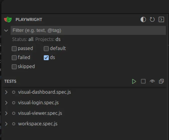
We need to generate the screenshots for the visual regression tests before making any changes, so we can compare the "before substitution" and "after substitution" states.
Execute the tests in the playwright's ds project. In order to do so, stop the Shadow CLJS compiler in tmux tab #1 and run;
clojure -M:dev:shadow-cljs release mainThis will package the frontend in release mode so the tests run faster.
In your terminal, in the frontend folder, run:
npx playwright test --ui --project=dsThis will open the test runner UI in the selected project.
The first time you run these tests they'll fail because there are no screenshots yet, but the second time, they should pass.
Import the new component #
In the selected file add the new namespace from the ds folder in alphabetical order:
[app.main.ui.ds.tab-switcher :refer [tab-switcher*]]
...

[:> tab-switcher* {}]
⚠️ NOTE: Components with a
*suffix are meant to be used with the[:>handler.
Please refer to Rumext User Guide for more information.
Pass props to the component #
Check the props schema in the component’s source file
(def ^:private schema:tab-switcher
  [:map
   [:class {:optional true} :string]
   [:action-button-position {:optional true}
    [:enum "start" "end"]]
   [:default-selected {:optional true} :string]
   [:tabs [:vector {:min 1} schema:tab]]])


(mf/defc tab-switcher*
  {::mf/props :obj
   ::mf/schema schema:tab-switcher}...)
This schema shows which props are required and which are optional, so you can include the necessary values with the correct types.
Populate the component with the required props.
(let [tabs
        #js [#js {:label (tr "inspect.tabs.info")
                  :id "info"
                  :content info-content}

             #js {:label (tr "inspect.tabs.code")
                  :data-testid "code"
                  :id "code"
                  :content code-content}]]

  [:> tab-switcher* {:tabs tabs
                     :default-selected "info"
                     :on-change-tab handle-change-tab
                     :class (stl/css :viewer-tab-switcher)}])
Once the component is rendering correctly, remove the old component and its imports.
Check tests after changes #
Verify that everything looks the same after making the changes. To do this, run the visual tests again as previously described.
If the design hasn’t changed, the tests should pass without issues.
However, there are cases where the design might have changed from the original.
In this case, first check the diff files provided by the test runner to ensure
that the differences are expected (e.g., positioning, size, etc.).
Once confirmed, inform the QA team about these changes so they can review and take any necessary actions.