Components
Speed your workflow with the reusable power of components.
A component is an object or group of objects that can be reused multiple times across files. This can help you maintain consistency across a group of designs.
Components basics
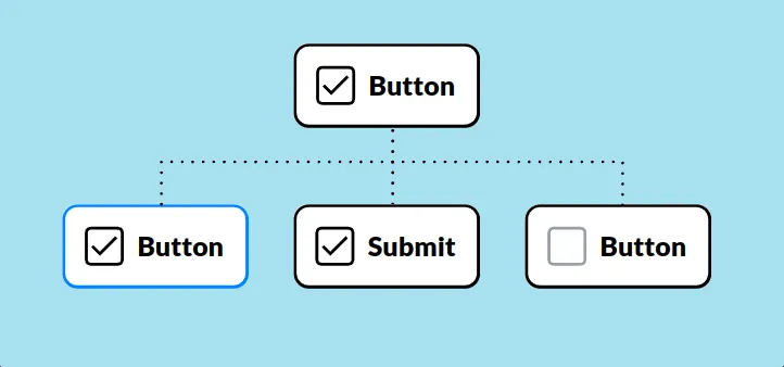
A component consists of two elements:
- Main component: The original source of truth. It defines the core properties of the component.
- Component copy (also known as instance): A duplicate of the main component that inherits its properties.
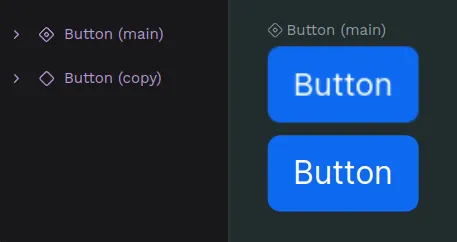
All component copies used in a file are linked in a way that updates made to the Main component can reflect in their component copies. You can override properties for component copies, so that you can manage singularities while maintaining properties in common.
Create components
Create a component
- Select an object or a group of them.
- Press Ctrl + K or right click and select the option “Create component” at the object menu.
Duplicate a component
You can duplicate a component the same way you can duplicate any other layer. When duplicating a component, you are creating a component copy that will be linked to its main component.
Duplicate as main component
You can duplicate a component as a new main component from the assets sidebar. Just select the component at the library, open the menu with right click and select the option "Duplicate main".
Delete a main component
You can delete main components and its copies anytime the same way you can delete any other layer.
Deleting a main component at the viewport means deleting it at the assets library and viceversa, so be careful!
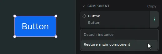
Restore a main component
If a main component has been deleted and you have access to a copy of it, you can use the copy to restore its main. There are two ways to do it:
- From the viewport menu: Select the component copy of a deleted main component, right click and press the option "Restore main component".
- From the sidebar menu: Open the sidebar menu of the component copy and press the option "Restore main component".
Find main components
Where's my component? There are ways to find main components at the assets panel and at the design viewport.
Find a main component at the assets panel
Select a main component at the viewport and then press "Show in assets panel" at the options of the right sidebar.
Find a main component at the viewport
Select a component copy and then press "Show main component" at the viewport menu or the right sidebar menu.
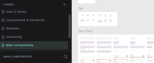
Main components page
If you find a page at a file called "Main components" this will probably mean that the file had assets with the previous components system and has been migrated to the current components system. The previous system didn't have the components as layers at the design file, only at the assets library, so when migrating a file to the new version Penpot automatically creates a page where to place all the components, grouping them using the library groups structure.
Working with components
Group components
At the Components section from the Assets library, there are two ways to create groups in a components library.
- Using slashes (/): Select one component and rename it as follows: "FOLDER NAME/COMPONENT NAME". For example, "Buttons/Alert Button".
- Using the "Group" option: Select one or more components at the Assets library, right click to show the menu and then select "Group".
Ungroup components
You can ungroup the components the same ways you can group them, via the menu option ("Ungroup" in this case) or renaming them.
Drag components to groups
One very direct way to move components between groups at the assets library is by dragging them.
Detach components
Detach a component copy to unlink it from its Main component and transform it into a group layer. Press Ctrl + Shift + K or right click and select the option “Detach instance” at the component menu.
You can also detach components in bulk by selecting several components and performing the same action.
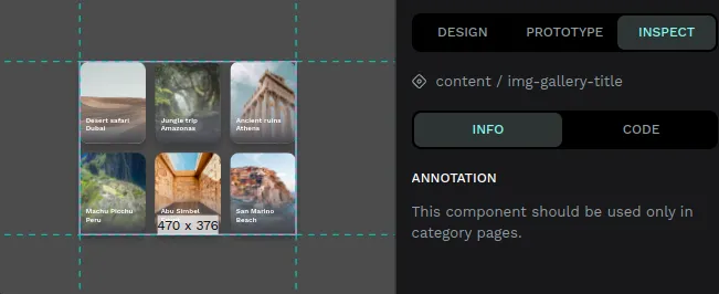
Annotate components
You can add text annotations to main components. The annotations are shown in every component copy. It is extremely useful to attach specifications that can be read at each component copy.
The annotations are also shown at the Inspect tab, as another option to improve communication between designers and developers.
Component Overrides & Relationships
Component overrides
Main components represent the more generic information of an element in a design system. You will usually need to change specific things (like a text, a color or an icon) in a component while maintaining the inheritance of the rest of it properties. Component overrides allows you to do that in Penpot.
Overrides are modifications made in a specific copy that are not in its main component. With overrides you can keep changes at the component copies while maintaining synchronization with the Main component.
Reset overrides
Right click and select the option “Reset overrides” at the component menu to get it to the state of the Main component.
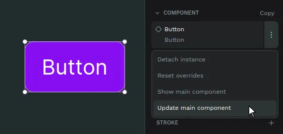
Update main from copies
You can push changes made at a component copy to a main component:
- Select a component copy that has changes that override one or more properties of its main component.
- Right click and select the option “Update main component” at the component menu. You can find this option at the viewport menu and at the sidebar menu.
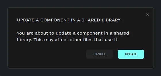
If the component that is about to be updated is located in a different file which is connected to this file as a shared library, a notification will be shown offering the options to update or dismiss.
Swap components
Penpot allows you to easily substitute component copies with other component copies.
- Select a component copy. You can not swap main components.
- At the right sidebar, press the component name to launch the swap menu.
- Choose the component you want to swap with and click on it.
Tip: The first options shown to swap a component are the ones at the same level inside the assets library, so group them properly.
Component Variants
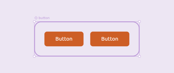
Variants allow you to group similar components, such as buttons, icons, or toggles, into a single, customizable component. Rather than navigating through separate components for every possible state, size, or style, you can manage them all from one unified component using clearly defined properties.
Imagine a single button component that can switch between primary and secondary styles, active and disabled states, and small to large sizes. Useful, right? That’s the power of Variants.
Why are Variants Important?
- Cleaner libraries
Keep related designs organized in the Design viewport, Layers panel, and swap menu. Variants streamline your components into tidy, manageable sets, allowing you to retain overrides when switching between them. - Faster design workflows
Make it easier to find and select the right version by quickly switching between states or styles using simple property controls. - Better team collaboration
With variants, you can match the way states are handled in code, helping designers and developers stay in sync, fostering better collaboration between design and development teams.
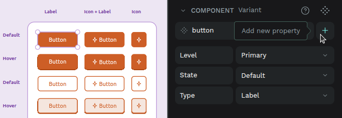
Understanding variants: properties and values
A component’s variants are organized by properties and their values.
- Properties define the dimensions that distinguish your variants (for example: Color, Size, State).
- Values are the specific options within a property (for example: Primary/Secondary, Small/Large, Default/Hover/Pressed)
Each variant is simply one unique combination of values across all properties (for example, Color=Primary + Size=Small + State=Hover).
Variants must have at least one property, and property values should be kept consistent to make switching predictable and to preserve overrides across connected layers.
Create and modify variants
Create variants
You can create variants from an existing component or from another variant:
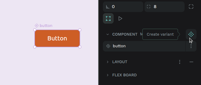
- From a component: Press Ctrl + K or right-click and select the menu option Create variant.
- From a variant: Select the variant and press Ctrl + K or right-click and select the menu option Create variant.
- By dragging: Drag a main component into an existing component with variants to add it as a new variant.
- From the Design tab (right sidebar): Select a component or a variant, open the context menu next to the component name and select the menu option Create variant.
When a variant is created:
- It appears next to the original in a dedicated variant area (by default in horizontal flex layout).
- Shared layers between variants are automatically connected (connection conditions) so that overrides can be preserved.
- Variants are named using their property values (e.g., Primary / Hover).
Manage variant properties
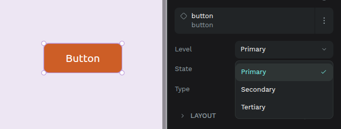
Properties are key to defining and differentiating your variants. They appear in the Design tab when a variant or component with variants is selected.
Add new properties
- From the Design tab: When the component or one of its variants is selected, you can add a new property via a menu. This property will be added to all existing variants with a default value (e.g., Value 1).
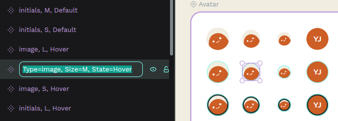
- From the Layers panel: using the formula
[property_name]=[value].
Edit properties
- From the Design tab: Select a component or a variant, then click on the property name to edit its name and/or value.
- From the Layers panel: using the formula
[property_name]=[value].
Delete properties
- From the Design tab: Select the main component (not an individual variant) and press the minus button next to the property.
- From the Layers panel: You can delete a property by editing the names of all variants so that none of them contain that property in their formula.
Variants must have at least one property. You can’t delete the last one.
When multiple variants are selected, the Design tab will show all their properties and values. If a property has different values across the selected variants, it will display “Mixed,” allowing you to override them collectively.
Delete Variants
- Select the variant, press right-click, and select the menu option Delete.
- Dragging a variant outside its component turns it into an independent component instead of deleting it.
If you delete the last variant, the entire component is removed.
Restore Variants
If you have a copy of a variant whose original was deleted, you can restore it:
- Select the variant copy, press right-click, and select the menu option Restore variant (will show if the main component still exists).
Use variants
Once you have created your variants, you can place a copy of a component with variants into your design and then switch between its different versions.
From the Assets tab
Drag and drop a component with variants from the Assets tab onto the design viewport, just like you would with any other component. Once placed, you can then use its properties in the Design tab to switch to the desired variant.
From the Design tab
When a variant is selected:
- You’ll see its properties and values.
- Change one or more property values to switch to another variant.
- If your chosen combination doesn’t exist, Penpot will suggest the closest match.
Understanding overrides
A key benefit of variants is the ability to preserve overrides when you switch between them. An override is a specific change you make to a component instance that diverges from its original definition (e.g., changing text content or a specific color).
Layers between variants are considered connected if they:
- Share the same name.
- Are the same type. Rectangle, ellipse, paths, and boolean operations count as the same type.
- Have the same hierarchy level. Groups, boards, and layouts are considered equivalent.
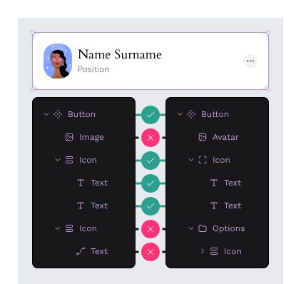
Example: If Variant 1 has a text layer named label with red color, and you change its content to Click here in an instance, then switch to Variant 2 (which also has a label text layer), the Click here content will be preserved, and Variant 2’s color will be applied.
Changing any of these (e.g., renaming or grouping a layer) breaks the connection, but reverting the change will restore it.
Bulk converting components to variants
If you already have multiple related components, you can combine them into a single component with variants:
- From Assets tab: Select components in the same group and right-click → Combine as variants.
- From viewport: Select multiple components → Right-click → Combine as variants.
- From Design tab: If conditions are met, a Combine as variants button appears on the component card.
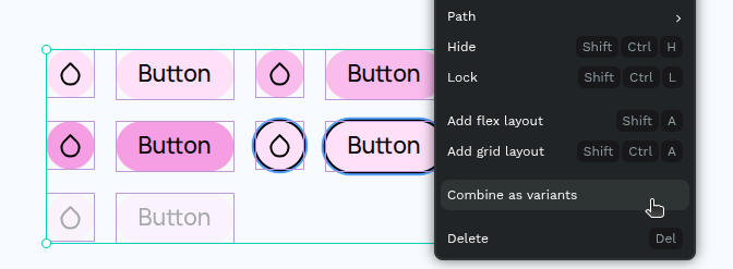
Conditions:
- Components must be on the same page.
- Components that already have variants cannot be combined.
When combined:
- A variant area is created containing all former components.
- Property names and values are generated from the component names.
Transforming Variants Back into Components
To turn a variant into an independent component:
- Drag it outside the variant area (Design viewport or Layers panel).
- Cut and paste it outside the variant area.
The new component’s name includes the original component name and the variant’s property values.