Layers
Layers are objects or items that you can place in the viewport. Boards, shapes, texts, paths and graphics are layers. The following describes the different layers that you have available in Penpot, and how to get the most of them.
Available layers
Boards
Boards are layers that serve as your high-level containers for content organization and layout. Boards are useful if you want to design for a specific screen or print size. Boards can contain other boards. First level boards are shown by default at the View mode, acting as screens of a design or pages of a document. Also, layers inside boards can be clipped. Boards are a powerful element at Penpot, opening up a ton of possibilities when creating and organizing your designs.
Create boards
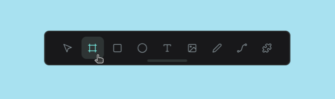
To create a board, use the board tool at the toolbar or the shortcut B.
Then, with the board tool selected, you have two options:
- Select a board size upfront. You can choose one of the provided presets with the most common resolution for devices and standard print sizes. Use the search field to filter presets by name.
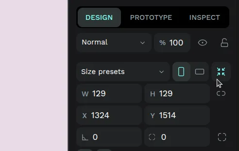
- Click-and-drag to draw a frame of approximate size, then immediately edit its width/height values to be precise.
TIP: Create a board around one or more selected layers using the option "Selection to board" at the menu or the shortcut Ctrl/⌘ + Alt + G.
Select boards
There are two different cases in terms of selecting boards:
- For first level boards that have at least one inside, click on the board name or Ctrl/⌘ + click on the board area to select it and then drag
- For the rest (empty first level boards and inside boards) just click to select.
Rename boards
There several ways to rename boards:
- Double click on the board name at the workspace viewport.
- Double click on the board name at the layers panel.
- Press Alt/⌥ + N to rename the board at the layers panel.
- Right click to show the menu and select "Rename".
Set board as thumbnail
At the workspace, select a specific board to be the file thumbnail that will be shown at the dashboard in the file card.
To set a custom thumbnail:
- Select a board.
- Right click to show the menu and select "Set as thumbnail" or press Shift T.
Copy link to board
You can get the link to each individual board, making it easy to share them with team members or include direct links in documentation.
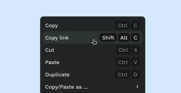
There are two ways to copy a direct link to a board:
- Using the menu: Select the board, right click and select the "Copy link" option.
- Using the shortcut: Select the board and press Shift/⇧ + Alt/⌥ + C.
Clip content
Boards offer the option to clip its content (or not).
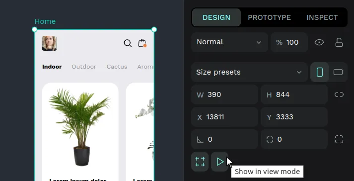
Show in View mode
Boards offer the option to be shown as a separate board/screen in the View mode. Use this setting to decide what boards should be shown as individual items in your presentations.
Defaults
As it is very likely that the first level boards will be used as a screen and the interiors will not, there are different defaults for newly created boards.
- Boards created at first level (the viewport): shown by default.
- Boards created inside other boards: not shown by default.
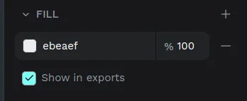
Show fill in exports
Sometimes you don’t need the artboards to be part of your designs, but only their support to work on them. Penpot allows you to decide if the fill of an artboard will be shown in exports, you just have to check/uncheck the "Show in exports" option which is below the fill setting.
Resize board to fit to content
You can adjust the board size to fit its content by clicking the icon in the design sidebar.
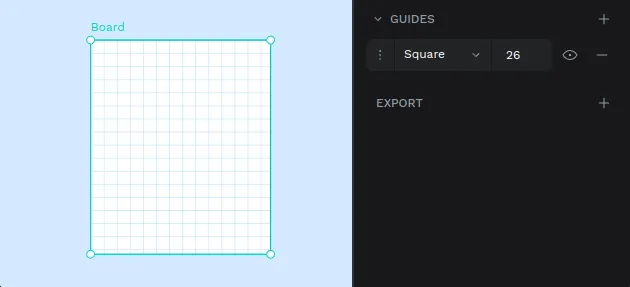
Board guides
You can set guides on boards that will assist with aligning layers.
Read more about guides.
Right-click a board and choose Clear artboard guides to remove all guides on that board.
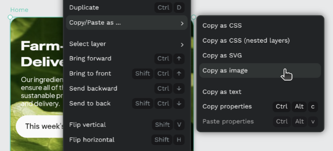
Copy as image
Copy as image copies a board as a bitmap to the system clipboard. Select a board, open the context menu, choose Copy/Paste as…, then Copy as image. Paste the result into other applications like any image.
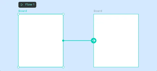
Prototyping boards
You can connect boards with other boards to create rich interactions.
Read more about prototyping.
Rectangles and ellipses
Rectangle and ellipses are two basic “primitive” geometric shapes that are useful when starting a design.
The shortcut keys are E for ellipses and R for rectangles.
To find out more about how to edit and modify these shapes go to Layer basics.
Text
Text layers are how you add copy to your designs in Penpot. If you want to go deeper into fonts, typography and advanced text options, check the dedicated Text & Typography section.
Curves (freehand)
The curve tool allows a path to be created directly in a freehand mode. Select the curve tool by clicking on the icon at the toolbar or pressing Shift/⇧ + c.
The path created will contain a lot of points, but it is edited the same way as any other curve.
Paths (bezier)
A path is composed of two or more nodes and the line segments between them, which may also be curved. To draw a new path you have to select the path tool by clicking on the icon at the toolbar or pressing P. Then you have two ways to create the path:
- Click to create a new corner node.
- Click and drag to create a curved node.
To finish the path:
- Close it clicking over the starting node.
- Leave it open pressing Esc or Enter to stop editing. Then press Esc to exit the edit mode.
Tip: If you hold Shift/⇧ while adding nodes the angle between the current and the next will change in 45 degree increments.
Edit nodes
To edit a node double click on a path or select and press Enter. You can choose to edit individual nodes or create new ones. Press Esc to exit node edition.
Node types
There are two types of nodes: curve or corner (straight). The type of a selected node can be changed at the bezier menu. Curved nodes have bezier handles that allow the curvature of a path to be modified.
Images
Insert images
There are several options for inserting an image into a Penpot file:
- Use the image tool at the toolbar or press K to insert images in your file system.
- Drag an image from your computer to the viewport.
- Copy an image & paste it or drag it right from a browser.
- Drag an image from a Penpot library.
Images aspect ratio
Images fill the layer backgrounds by default, so they take up the entire layer while maintaining the aspect ratio. This is great for flexible designs because the images can adapt to different sizes.
However, if you don't want an image to keep its aspect ratio when resizing, you just have to uncheck the option in the image settings.
Layer actions
Create
To create a layer you have to select the type of layer by clicking the selected tool (board, rectangle, ellipse, text, image, path or curve) at the toolbar. Then you usually have to click and drag your mouse on the viewport.
Hold Shift/⇧ while creating an ellipse or a rectangle to maintain equal width and height.
Paste to replace
Paste to replace replaces the selected shape with the clipboard contents, keeping the selection. Use the context menu or press Ctrl/⌘ + Shift/⇧ + V.
Duplicate
There are several ways to duplicate a layer:
- You can press Ctrl/⌘ + D to duplicate a layer right over a selected layer.
- If you press right click over a selected layer at the viewport or at the layers panel you can use the option at the layer menu.
- You can also select a layer and drag while pressing Alt/⌥ so you can simultaneously duplicate and drag the new layer.
Delete
There are a couple ways to delete a layer.
- You can press Supr/⌫ to delete a selected layer.
- If you press right click over a selected layer at the viewport or at the layers panel you can use the option at the layer menu.
Move
To move one or more layers on the viewport you have to select them first and then click and drag the selection where you want to place them. You can also use the design panel to set a precise position relative to the viewport or the board.
Select
The simplest way to select a layer is to click on it. Make sure that you have the “move” pointer selected at the toolbar.
To select multiple layers you can click and drag around the layers you want to select. You can also click more than one layer while pressing Shift/⇧. If you hold Shift/⇧ and click you can deselect layers individually.
Selecting layers at the layers panel
- Click a layer to do a single selection.
- Press Ctrl/⌘ while clicking two or more layers to do a multiple selection.
- If you press Shift/⇧ while selecting two or more layers all the layers within the selection area will be selected.
Select layers ignoring groups (deep selection)
If you want to select an element that is difficult to reach because it is under a group of elements, hold Ctrl/⌘ to make the selection ignore group areas and treat all the layers as being at the same level.
Select layers inside groups
To select a layer inside a group you do double click. First click selects the group, second click selects a layer.
Select layer menu
At the dropdown menu (right click on a layer to show it) there's the option "Select layer" that allows the user to select one layer among the ones that are under the cursor's location.
Hide and lock layers
Hide and show layers
You can control the visibility of any layer by clicking the eye icon next to it in the Layers panel. When a layer is hidden, it will not appear on the canvas, but you can still select it in the Layers panel, move its order, or modify its properties. The eye icon always indicates whether a layer is visible or hidden, making it easy to manage complex designs.
Lock and unlock
Locking a layer helps prevent accidental changes or movement on the canvas. When a layer is locked, it cannot be moved or edited directly in the canvas area. However, you can still select a locked layer in the Layers panel and adjust its properties, such as color, effects, or name. The lock icon next to the layer’s name shows its locked status, helping you keep your design organized and protected.
Group
Grouped layers can be moved, transformed or styled at the same time.
- Group: To group two or more layers, select them and then press Ctrl/⌘ + G. You can also use the option at the layers menu that you can open with right click.
- Ungroup: Press Shift/⇧ + G or use the option at the layers menu that you can open with right click over the selected group.
Mask
A mask is a layer that does a clipping and only shows parts of a layer or multiple layers that fall within its shape.
- Mask layers: Select more than one layer or a group of them. Then you can apply the masking using the option at the layers menu or by pressing Ctrl/⌘ + M. The shape that is at the lowest level at the layer list will be used as a mask.
- Unmask layers: Select a mask and then press Shift/⇧ + Ctrl/⌘ + M or use the option at the layers menu.
Resize
To resize a selected layer you can use the handles at the edges of the selection box. Make sure the cursor is in resizing mode. You can also use the design panel where you can link width and height.
- Hold Shift/⇧ while resizing the layer to preserve its aspect ratio.
- Hold Alt/⌥ while resizing the layer to do it from the center and resize simultaneously two opposite sides.
Scale elements, texts and properties
Activate the scale tool by pressing K or from the main file menu to scale elements while maintaining their visual aspect. Once it is activated you can resize texts, layers and groups and preserve their aspect ratio while scaling their properties proportionally, including strokes, shadows, blurs and corners.
Rotate
To rotate selected layers you can use the handles at the edges of the selection box. Make sure the cursor is in rotation mode. If you hold Ctrl/⌘ while rotation the angle will change in 45 degree increments. You can also find this option at the design panel.
Flip
You can find the options to flip layers in their contextual menu (select the layer and right click). You also have shortcuts to do this:
- Flip layers horizontally: Select the layer and press Shift/⇧ + H
- Flip layers vertically: Select the layer and then press Shift/⇧ + V.
Align and distribute
Aligning and distributing layers can be found at the top of the Design panel.
Align layers
Aligning will move all the selected layers to a position relative to one of them. For instance, aligning top will align the elements with the edge of the top-most element.
Distribute layers
Distributing layers to position them vertically and horizontally with equal distances between them.
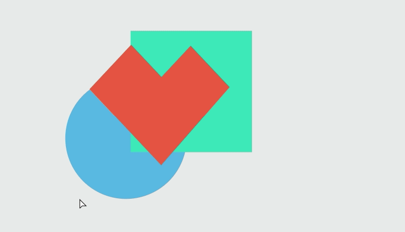
Boolean operators
It is possible to combine shapes in a group in different ways to create more complex layers by using "boolean" operators. Boolean operators are non destructive and the original shapes remain grouped and available for more editing. There are five boolean operations available: union, difference, intersection, exclusion and flatten. Using boolean operations allows many graphic options and possibilities for your designs.
- Union: the resulting combination is the sum of the shapes.
- Difference: the opposite of union, the resulting layer has the area of the shape on top has been cut out from the shape at the bottom.
- Intersection: creates a group whose shape is the overlapping area between the shapes.
- Exclusion: the opposite of intersection, the resulting shape is the area that does not overlap between the shapes.
- Flatten: Tecnically not a boolean operator, this is the way to permanently combine the paths of a group of shapes in a single one.
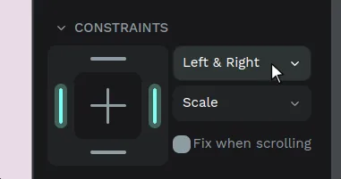
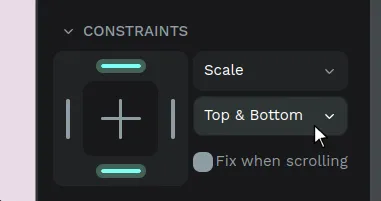
Resizing constraints
Constraints allow you to decide how layers will behave when resizing its container.
Apply constraints
Constraints allow you to decide how layers will behave when resizing its parent container. You can apply horizontal and vertical constraints for every layer.
To apply constraints select a layer and use the constraints map or the constraints selectors at the design panel.
Constraints are set to “Scale” by default, but you have other options.
Horizontal constraints
- Left: The layer maintains its size and position relative to the left side of its parent container.
- Right: The layer maintains its size and position relative to the right side of its parent container.
- Left & right: The layer resizes while maintaining its distance to both horizontal sides of its parent container.
- Center: The layer maintains its size and position relative to the horizontal center of its parent container.
- Scale: The layer will horizontally resize proportionally to its parent container size.
Vertical constraints
- Top: The layer maintains its size and position relative to the top side of its parent container.
- Bottom: The layer maintains its size and position relative to the bottom side of its parent container.
- Top & bottom: The layer resizes while maintaining its distance to both vertical sides of its parent container.
- Center: The layer maintains its size and position relative to the vertical center of its parent container.
- Scale: The layer will vertically resize proportionally to its parent container size.
Styling layers
Penpot has a variety of properties for each layer. When selected, the options are displayed in the design panel on the right.
Border radius
You can customize the border radius of rectangles and images, with the option to customize each corner individually.
Shadow
Adding shadows is easy from the design panel. You can add as many as you want.
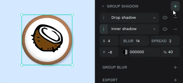
Shadow options are:
- Type - Drop (outside the layer), inner (inside the layer)
- Horizontal position (X)
- Vertical position (Y)
- Blur
- Spread
- Color and opacity
Blur
You can add blur effects to layers from the Design sidebar. Penpot supports two types:
- Layer blur blurs the layer content itself.
- Background blur blurs whatever sits behind the layer. Use it for frosted-glass or depth effects. Background blur requires the WebGL renderer to be enabled.
Background blur is not included in exported files yet (PNG, SVG, PDF, and others). The exporter still uses the legacy SVG renderer, so the effect only shows in the workspace and View mode. Export support is a current priority and will land in an upcoming release.
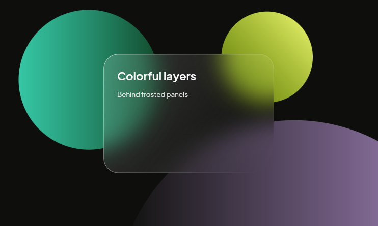
Click + in the Blur section to add an effect. You can apply both types on the same layer. Use the type selector to switch between them, the eye icon to show or hide an effect without removing it, and the value field to set the blur amount.
Applying many or large blur values can affect Penpot’s performance, as it requires a lot from the browser.
Opacity and blend
Set the overal opacity for layers and their blend mode.
Blend allows you to control how a layer interacts with the layers beneath it, determining how pixels from the current layer are combined with pixels in the underlying layers. Use blend to achive various effects, such as shading, highlights, or creative visual styles.
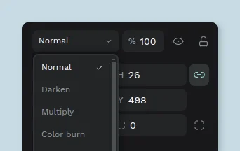
Blend options available:
- Normal
- Darken
- Multiply
- Color burn
- Lighten
- Screen
- Color dodge
- Overlay
- Soft light
- Hard light
- Difference
- Exclusion
- Hue
- Saturation
- Color
- Luminosity
Copy/Paste properties
You can copy and apply properties, including fills, strokes, shadows, and others from one layer to another—or multiple layers with just a few clicks. You can do it using the layer's menu or shortcuts.
Using the layer menu
- Select one layer.
- Right click to show the layer menu.
- Press Copy/Paste as... > Copy properties.
- Select one or more other layers.
- Right click to show the layer/s menu.
- Press Copy/Paste as... > Paste properties.
Using Shortcuts
- Copy properties: Ctrl/⌘ + Alt/⌥ + C
- Paste properties: Ctrl/⌘ + Alt/⌥ + V