Flexible Layouts
Penpot's proposal tries to get as close as possible to the final output that we will see on the web. Design and development speak the same language in order to embrace web standards and improve communication between roles. At Penpot you have unique ways to create and manage adaptative layouts that have all the advantages of CSS standards.
Flex Layout
Penpot's unique Flex Layout allows you to create flexible designs that can adapt automatically. Resize, fit, and fill content and containers without the need to do it manually.
To help you learn the fundamentals of Flex Layout here’s a dedicated website where you will find a video tutorial and a playground template.
Flex Layout is based on Flexbox CSS standard
Penpot's Flex Layout is built over Flexbox, a CSS module that provides a more efficient way to lay out, align and distribute space among items in a container. There are many comprehensive explanations about Flexbox, if you are interested we recommend you to read the one at CSS Tricks.

Add Flex Layout
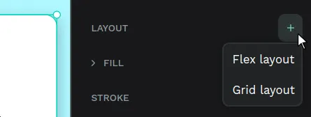
You can add Flex Layout to any layer, group, board or a selection including any of these. Once Flex Layout Flex is added the selected elements will be contained into a board with the Flex Layout properties. You have several ways to do this:
- From the Design panel at the right sidebar.
- From the option at the selection menu (right click button).
- Pressing Ctrl/⌘ + A.
Arrange and reorder layers to a Flex Layout
To add a layer to a Flex Layout you can just drag it at the position of your choice. You can also create or paste elements like in any regular board.
To reorder elements you can drag them or use the UP/DOWN keystrokes.
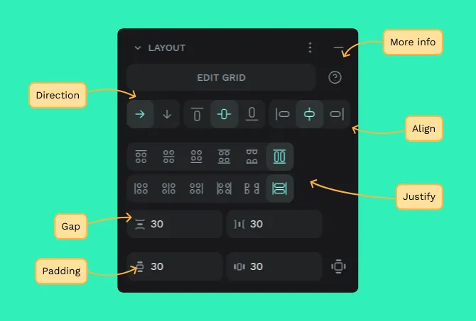
Flex Layout properties
You have properties for direction, align, justify, gap, padding, margin and sizing. Those are the same properties that you can use with CSS Flexbox. You can read here detailed explanations about Flexbox properties.
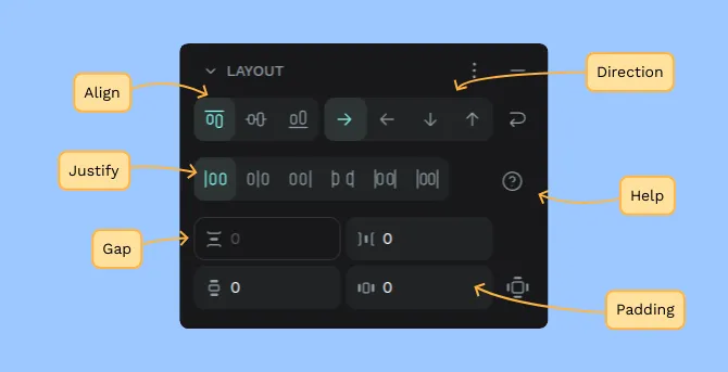
Flex Layout properties:
- Direction: Row, reverse row, column, reverse column.
- Wrap (Direction): Align content start / center / end / space-around / space-between.
- Align items: Start, center, end.
- Justify content: start, center, end, space-between, space-around, space-evenly.
- Gap: Row, column.
- Padding: Top, right, bottom, left.
- Sizing: Fix/fit width, Fix/fit height.
Positioning flex elements
Position static:
Static position is the default option for flex elements, meaning that they will be included in the flex flow, using flex properties.
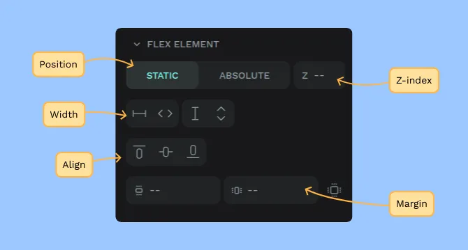
Absolute positioning:
Selecting absolute positioning will exclude the element from the Flex layout flow allowing you to freely position an element in a specific place regardless of the size of the layout where it belongs.
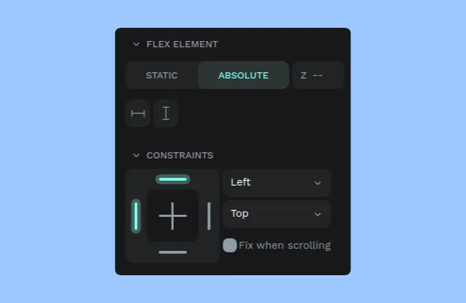
Z-index:
With the z-index option you can decide the order of overlapping elements while maintaining the layers order.
Managing flex spacing
When creating Flex layouts, the spacing is predicted, helping you to maintain your design composition.
Set paddings, margins and gaps using their respective numeric inputs.
You can also click and drag to resize them while visualizing the value that is being edited:
- Hold Shift/⇧ while dragging to change the value of opposite sides evenly.
- Hold Alt/⌥ while dragging to change the value of all sides evenly.
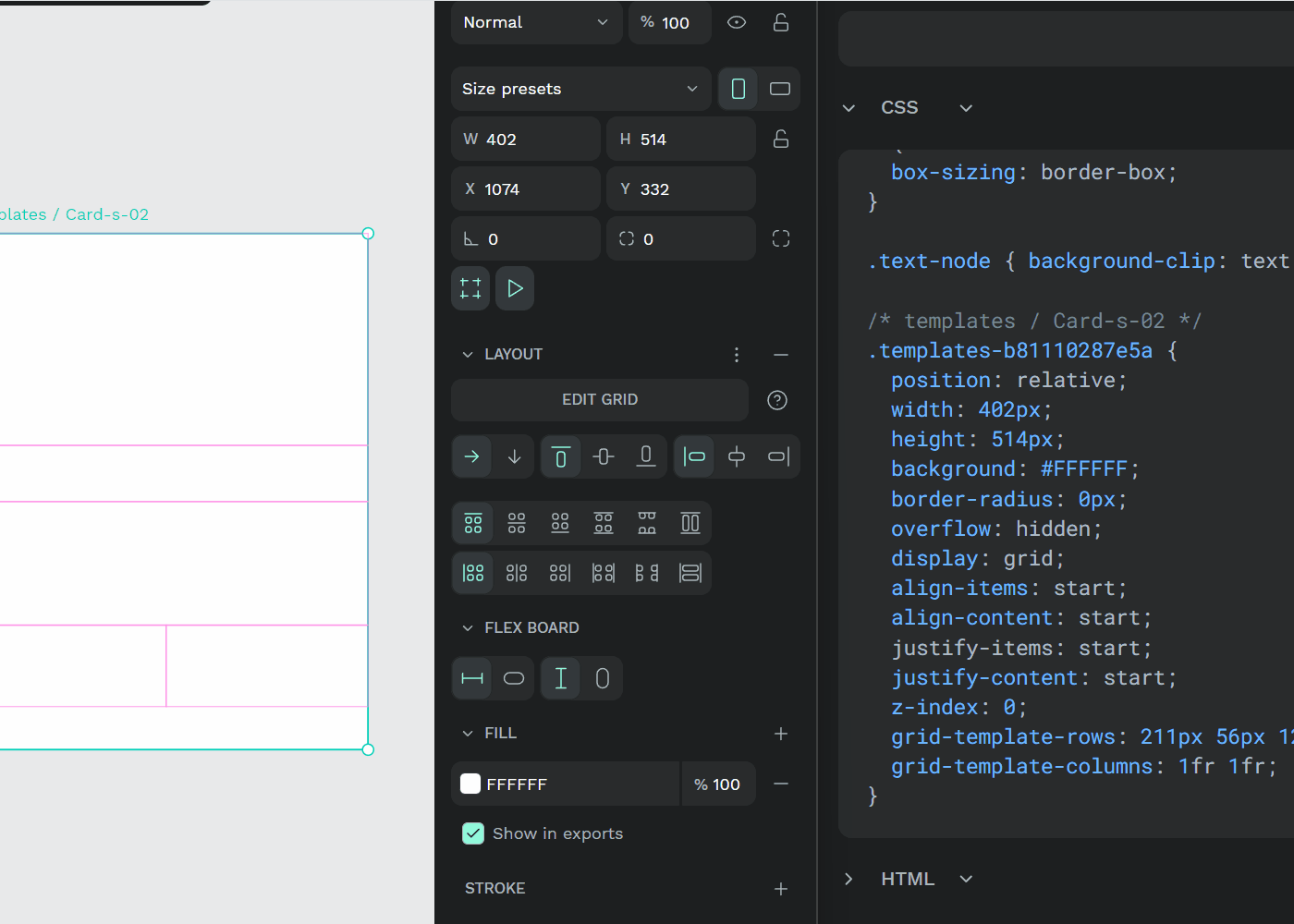
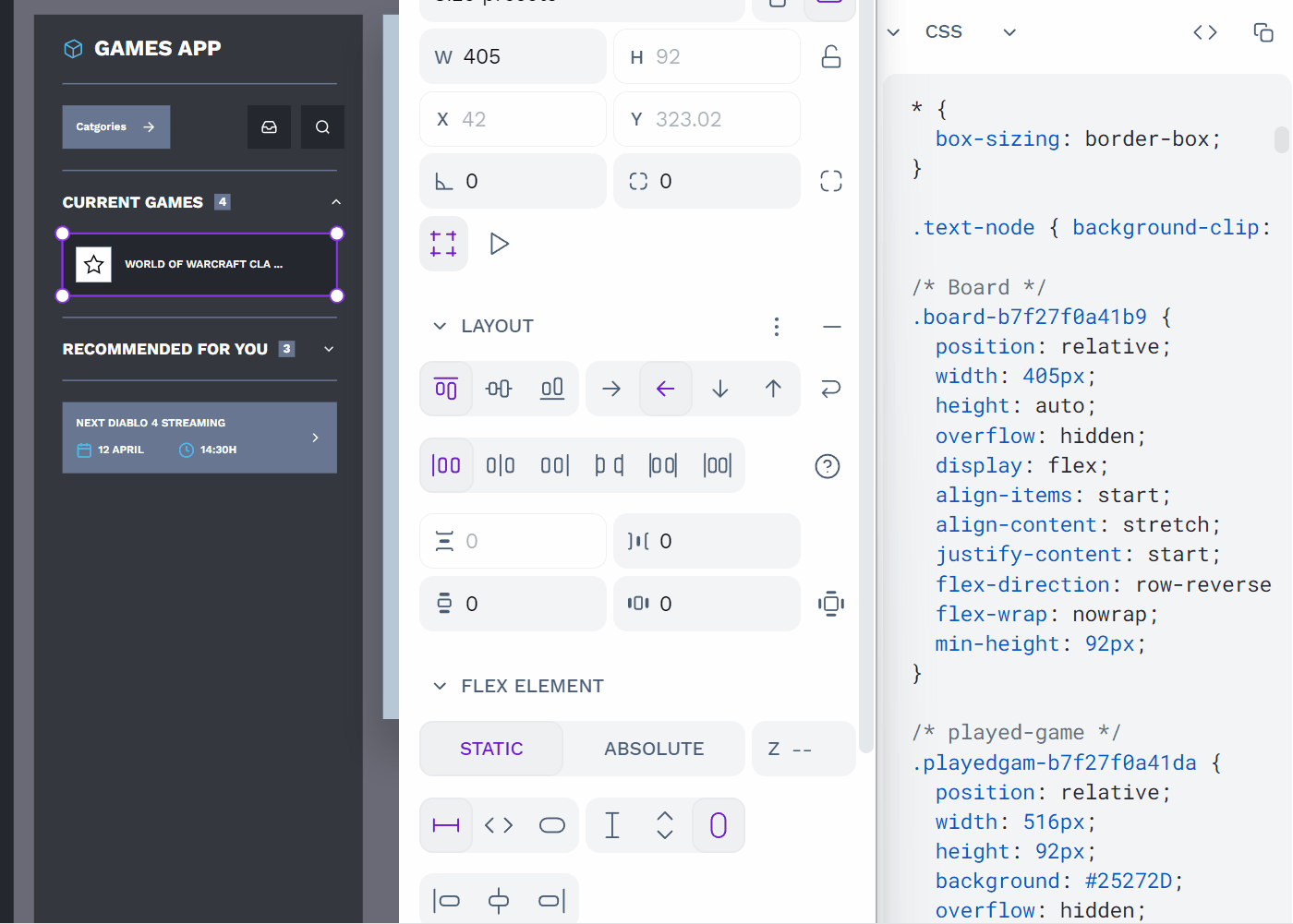
Get code and specifications
Designing with Flex Layout generates ready for production code. Select the flex board or its inner elements and then open the Inspect tab to obtain its properties, detailed info and raw code.
Flex Layout basic examples
How to create a button
A classic example that will help you create flexible buttons that grow depending on its content.
How to create a list
Extremely useful for ordering list items. Remember to set fit height to the container so it can adapt to the number of items.
Wrapping elements
Use the wrap property along with row direction to get the elements positioned in multiple lines.
Grid Layout
Grid Layout allows you to efficiently organize, align, and distribute items in 2-dimensional layouts. You can create rows and columns of elements, giving you fine-grained control over their expansion, alignment, and responsiveness to various screen sizes. It's a powerful tool for creating responsive designs.
Grid Layout is based on CSS Grid standard
Penpot's Grid Layout is built over CSS Grid, a fairly new CSS module. If you are interested to know more about this CSS module we recommend checking out the comprehensive explanation Guide to CSS Grid at CSS Tricks.
Add Grid Layout
You can add Grid Layout to any layer, group, board or selection. Once Grid Layout Flex is added the selected elements will be contained into a board that handles its space through Grid Layout properties. You have several ways to add Grid Layout:
- From the Design panel at the right sidebar.
- From the option at the selection menu (right click button).
- Pressing Ctrl/⌘ + Shift + A.
Grid layout basic terminology
- Container: The container is the parent element of all the grid items.
- Cell: A single unit of the grid. Cells are the children elements of a grid container.
- Area: A composition of any number of grid cells.
- Gap: The space between grid items (cells and areas), both horizontally and vertically.
- Row: The horizontal lines that define the rows of the grid.
- Column: The vertical lines that define the columns of the grid.
Grid Layout properties
There are properties both for Grid containers and Grid items (cells, rows, cols). Those are the same properties that you can use with CSS Grid. You can read here detailed explanations about CSS Grid properties.
Grid containter properties
- Direction: Row, column.
- Align items (vertically and horizontally): Start, center, end.
- Justify items (vertically and horizontally): Start, center, end, space-around, space-between, stretch.
- Gap: Row, column.
- Padding: Top, right, bottom, left, vertical, horizontal.
Grid cell properties
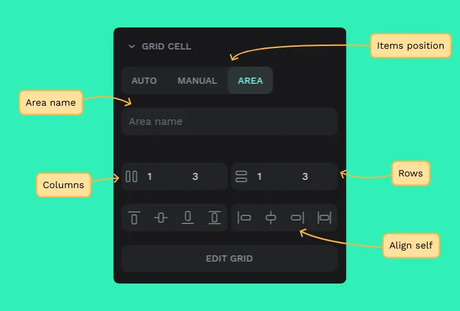
These are different ways to manage the element's position that therefore have different code representation.
- Auto: The elements are positioned in order inside the cells so that if a new element enters the flow the rest get repositioned. This is the default behaviour.
- Manual: The elements are positioned in specific cells or areas. Elements inside area cells will have the css properties
grid-columnandgrid-row. - Area: A cell or area with an Area name. Areas behave as Manual cells.
Align self (vertically and horizontally): Start, center, end, stretch.
Placing grid elements
To place elements inside a grid layout, just drag them or paste them in a cell or area.
Tip: Drag an element over a grid and then press Ctrl to place it as auto. That way the layer will be positioned automatically in the first available cell or area.
Grid element properties
- Position: static, absolute.
- Width: fix, 100%.
- Margin: top, right, bottom, left.
Edit rows and columns
To edit grid layouts (rows, columns, units, cells, areas, etc) you can either select the board and press the "Edit grid" button or double click over the board.
You have several ways to edit rows and columns:
Design sidebar
From the design sidebar you will be able to:
- Get info about columns and rows: Press the 3 dots besides the Columns or the Rows section to get details.
- Add columns and rows: Press the + button to add a column or a row.
- Delete columns and rows: Press the - button to delete a specific column or row.
- Drag columns and rows: You can reorder columns and rows by clicking and dragging over the drag icon.
- Change sizes and units: Change specific sizes and units of each row and column.
Tip: You cand drag columns and rows while leaving the elements in the same position if you perform the action while pressing Ctrl.
Design viewport
From the design viewport you will be able to:
- Add columns and rows: Press the + button at the end of the headers to add a column or a row.
- Drag columns and rows: To drag columns and rows hover a column or row header until the hand cursor is shown and then click and drag it.
- Change sizes and units: Drag the columns and rows numbers and change specific sizes and units on their headers.
Tip: You can drag columns and rows while leaving the elements in the same position if you perform the action while pressing Ctrl.
Contextual menu
To launch the contextual menu of rows and columns you can right click over a column or row header or left click on the menu button.
From the contextual menu of rows and columns you will be able to:
- Duplicate row/column
- Add 1 row/column to the left
- Add 1 row/column to the right
- Delete row/column
- Delete row/column and shapes
Grid units
You can use different units at your grid columns and cells:
- FR: FR stands for "fractional unit", meaning "portion of the remaining space". If a grid has 2 columns being one 1fr and the other 3fr, the first one will take 25% of the space while the other 75%.
- Auto: The row/col size will be automatically set, relative to the items and the available space.
- Pixels: Well, we all know pixels, don't we?
Areas
Areas are compositions of any number of grid cells.
Create areas
You have two ways to create areas:
1. Select more than one cell pressing left click while holding Ctrl, then press right click to open the menu and then press the option "Merge cells".
2. Select one cell pressing left click, then hover near the limit to the cell you want to merge the selected cell with until the cursor changes. Then drag the cursor to merge the selected area to other areas in the same direction.
Name areas
To name an area, select the "Area" option at the grid cell properties (right sidebar) and fill the name of the area.
Undo areas
To turn areas back to regular cells, just select the "Auto" option at the grid cell properties (right sidebar).
Grid code and specifications
Grid layout at Penpot behaves just like CSS Grid because it is actually using the CSS Grid standard. This means that you can just switch to Inspect mode, get the code and use it in real websites.