Prototyping
Learn how to build interactive prototypes to visualize how users navigate through your screens and mimic your product behaviour.
Penpot allows you to prototype interactions by connecting boards, which can act as screens. Once the prototype is prepared with interactions and/or flows, it can be used at the View mode and shared through a link.
Connect boards
The simplest and most usual way to prototype an interaction at Penpot is connecting boards. Add interactions following this simple steps:
- Open a file with at least two boards.
- Activate Prototype mode clicking at the tab at the right sidebar.
- Select the layer (shape, board or group) that will trigger the interaction.
- Drag a connection from the selected layer to the destination board.
- A flow start will be automatically created. More about flows.
- Launch the interactive prototype to see it in action in the View mode (access by clicking the play button at the top right).
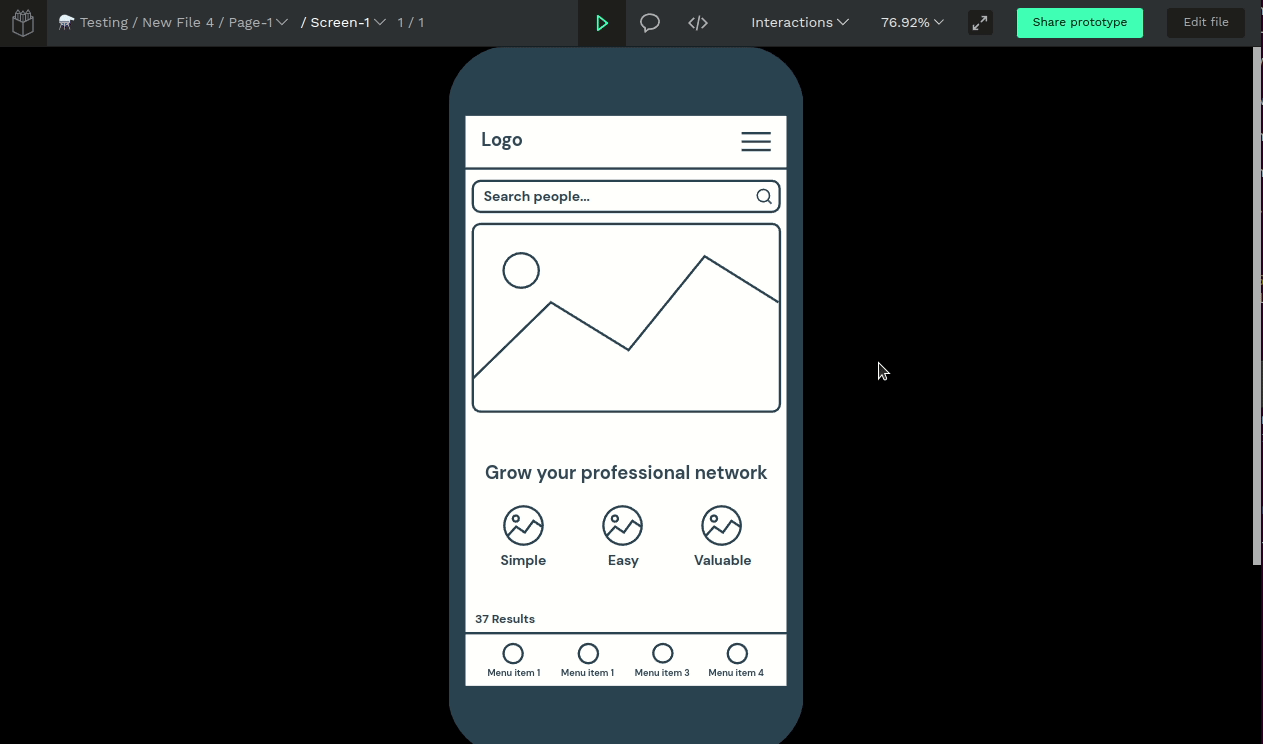
Anatomy of a prototype
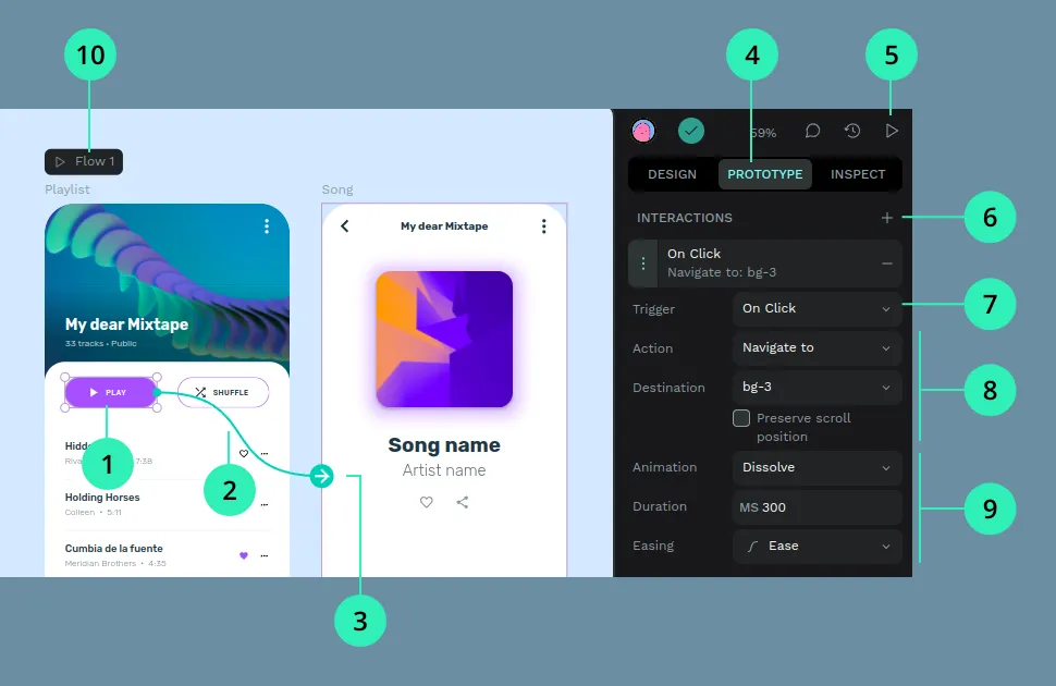
1) Hotspot (origin connection) 2) Connector wire 3) Destination 4) Prototype mode tab 5) View mode launcher 6) Add new interaction 7) Interaction trigger 8) Interaction action 9) Interaction animation 10) Flow indicator and launcher
Interaction settings
When a layer with interactions is selected, the Prototype sidebar lists every connection attached to it. From there you can change the trigger, action, destination, animation, and other options.
Destination dropdowns include a search field. Type to filter boards on the current page when your file has many screens.
Interaction triggers
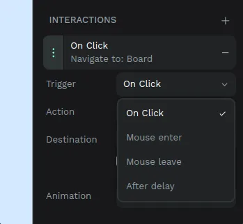
A trigger defines the user action that will start the interaction. Penpot currently provides the following triggers (more of them will come):
- On click: when user clicks or tap the hotspot.
- Mouse enter: when the mouse enter the hotspot area.
- Mouse leave: when the mouse leaves the hotspot area.
- After delay: when a certain time has passed after a board is shown. Note: this can only be set at boards.
Interaction actions
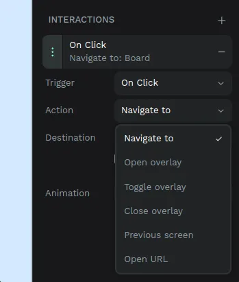
The action defines what will happen when the interaction is triggered. Penpot currently provides the following actions (more of them will come):
- Navigate to.
- Open overlay.
- Toggle overlay.
- Close overlay.
- Previous screen.
- Open URL.
Navigate to
The classic, most usual of the prototyping actions. It takes the user from one board to the destination set in the interaction.
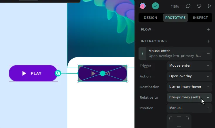
Open overlay
It opens a board right over the current board. This action is typically used to display tooltips, modal windows or notifications.
You have several presets for positioning the overlay (center, top left, top right...) but you can also do it manually. Just select the “Manual” option and drag the “ghost” (an area with the size of the destination board) to the place you want the overlay to show up.
There are also a couple of options that facilitates to mimic typical overlay behaviours:
- Close when clicking outside: the overlay is closed if the user clicks outside its area.
- Add background overlay: a black background with 20% opacity is added.
TIP: You can select to open the overlay relative to the element that triggers it using the field "relative to". This is extremely useful for hover effects.
Toggle overlay
It opens an overlay if it is not already opened or closes it if it is already opened.
Close overlay
This action will close a targeted board that is opened as an overlay. It can be also set to “self” so the board can be closed from itself.
Previous screen
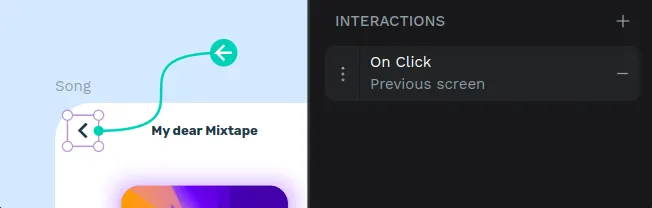
It takes back to the last board shown. This action is typically used for back buttons, when the same screen can be accessed from different origins.
Open URL
This action opens an URL in a new tab. This is useful to add external links outside of the prototype.
Interaction animations
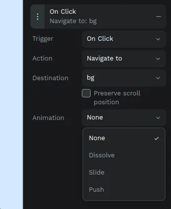
The animation defines the transition between boards when the interaction is triggered. Penpot currently provides the following actions (more of them will come):
- Dissolve.
- Slide.
- Push.
Dissolve
Dissolve means that the destination board fades in while the origin board fades out.
Options:
- Easing.
- Duration.
Slide
Slide animation will move the destination frame in or out of the view.
Options:
- IN / OUT.
- Direction (right, down, left, top).
- Easing.
- Duration.
- Offset effect.
Offset effect means that the origin board will slightly fade and move in the same direction of the destination board.
Push

Push animations will move the destination board into view pushing out the origin board.
- Direction (right, down, left, top).
- Easing.
- Duration.
Flows
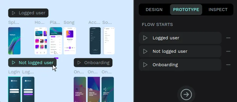
Design projects usually need to define multiple casuistics for different devices and user journeys. Flows allow you to define one or multiple starting points within the same page so you can better organize and present your prototypes.
A flow is defined by a starting board for an interaction. Flows can be selected independently at the view mode. Each flow has its own shareable link at the View mode.
Starting points
A starting point is a board selected to be the first screen of a flow. You could set a board as a starting point just because you want this board to be the first one to be shown in the view mode, but you can also set more starting points to define different user journeys.
There are several ways to create starting points:
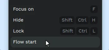
- Automatically: when creating a connection from a board which is not connected yet (meaning that it does not belong to an existing flow), the origin board will be set as a flow start.
- From the prototype sidebar: having a board selected, click on the “+” button to set it as a flow start.
- From the board menu.
Multiple flows
You can add as many flows as you want. The complete list of flows is shown at the prototype sidebar when no shape is selected.
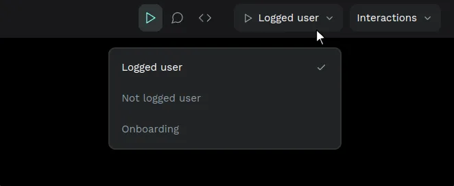
Flows at the view mode
At the view mode there’s a menu where you can access to all the flows set and easily switch between them.
Fix elements at scroll
You can fix the position of a layer when scrolling at the presentation view. This is tipically useful for prototyping fixed headers, navbars and floating buttons.
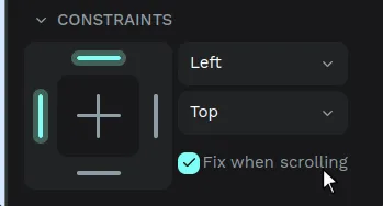
Select an element and check the option "Fix when scrolling" that you can find inside the Constraints section at the Design sidebar (right side).
Launch the View Mode to see the elements with a fixed scroll position.