The interface
The Penpot interface has three main areas: Dashboard, Workspace and View mode. Lets take a look at their composition and main features.
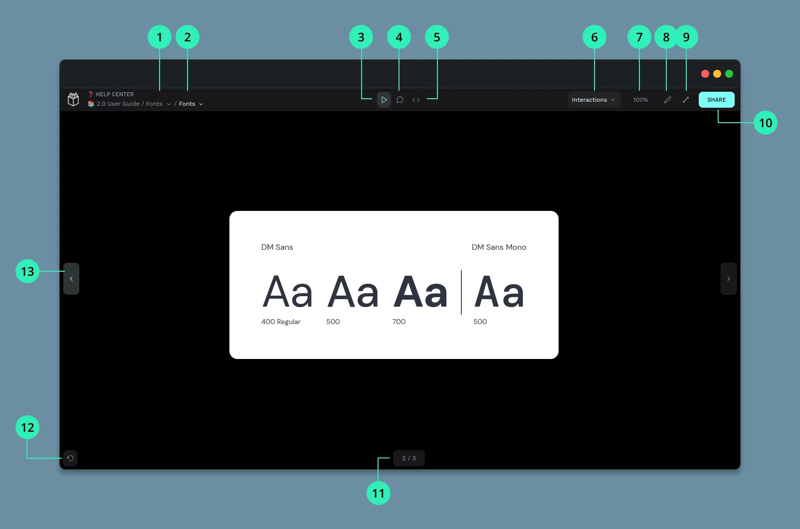
Workspace
The Workspace is where you actually create your designs. You have an infinite canvas where you can work directly but you also have the ability to create and work inside boards that will help you to create pages and exportation units.
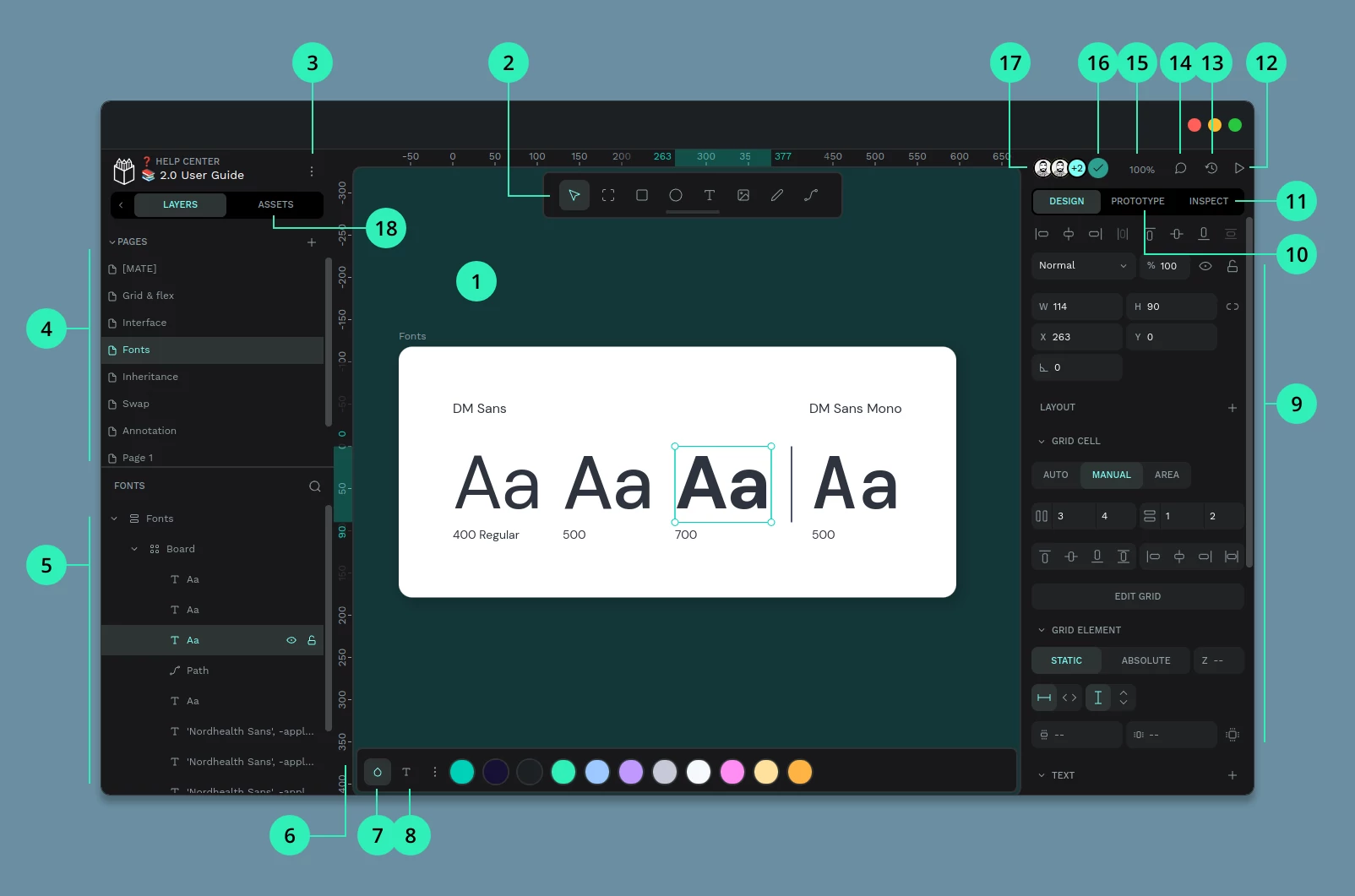
1) Viewport 2) Toolbar 3) Main menu 4) Pages 5) Layers 6) Rulers 7) Color palette 8) Typography palette 9) Design properties 10) Prototype mode 11) Inspect mode 12) View mode 13) Share / Invite 14) History 15) Comments 16) Zoom 17) Users 18) Assets 19) Design tokens 20) File status
- Viewport: An infinite canvas where you can design without limits.
- Toolbar: This is where you’ll find all the tools to quickly and easily create different types of objects: board, rectangle, ellipse, text, graphic, path, and free drawing. Learn more about objects.
- Main menu: From the main menu, you can customize your workspace. Manage the visibility of grids, rulers, and panels. Enable or disable snapping and dynamic alignment. Add or remove the file as a Shared Library. You’ll also find help resources here.
- Pages: A file can contain as many pages as you need. Each page has its own viewport (the almost infinite area where you design) and its own layers. You can create, delete, or reorder pages as needed.
- Layers: Layers are the different objects you can place in the design viewport. Learn more about layers.
- Rulers: Rulers provide coordinates to help you design. You can also drag guides from them.
- Color palette: The color palette gives you quick access to a visible library of colors. Use the menu to easily switch between libraries. Learn more about the color palette.
- Typography palette: The typography palette keeps text styles always at hand. Use the menu to switch between libraries.
- Design properties: The Design Properties sidebar lets you view and edit the attributes of a selected layer. The list changes depending on the element type: some properties are always present (size, position), while others are optional (stroke, shadow, blur…). Learn more about styling.
- Prototype mode: Penpot lets you prototype interactions by connecting boards. Activate prototype mode from the right sidebar, then select an element and drag a connection to another board. You can preview the interactive prototype in View Mode (access it by clicking the play button in the top-right corner). Learn more about prototyping.
- Inspect mode: Use Inspect Mode to get measurements, properties, and production-ready code from your designs. It also provides a safer, view-only mode with additional improvements. Learn more about inspecting designs.
- View mode: The View Mode button launches a presentation of your boards. Explore more features in the View Mode guide.
- Share / Invite: Invite team members to give them access to this file and all team files.
- History: The History panel records recent changes in an open file. Use undo/redo to step through changes, and expand each entry for detailed information. Learn more about the history panel.
- Comments: Switch to Comments Mode to view all comments on the file and add new ones.
- Zoom: Options to zoom in, zoom out, or fit the canvas.
- Users: See how many users currently have the file open.
- Assets: Each file includes a default File Library where you can store reusable elements and styles, such as components, colors, and text styles. From this panel, you'll be also able to include and use shared libraries.
- Design tokens: Design tokens are the building blocks of UI elements, expressed in a format usable across design, tools, and code. They include colors, typography, spacing, shadows, and more.
- File status: Displays the file’s saving state, showing whether your latest changes are saved or if there’s a problem.
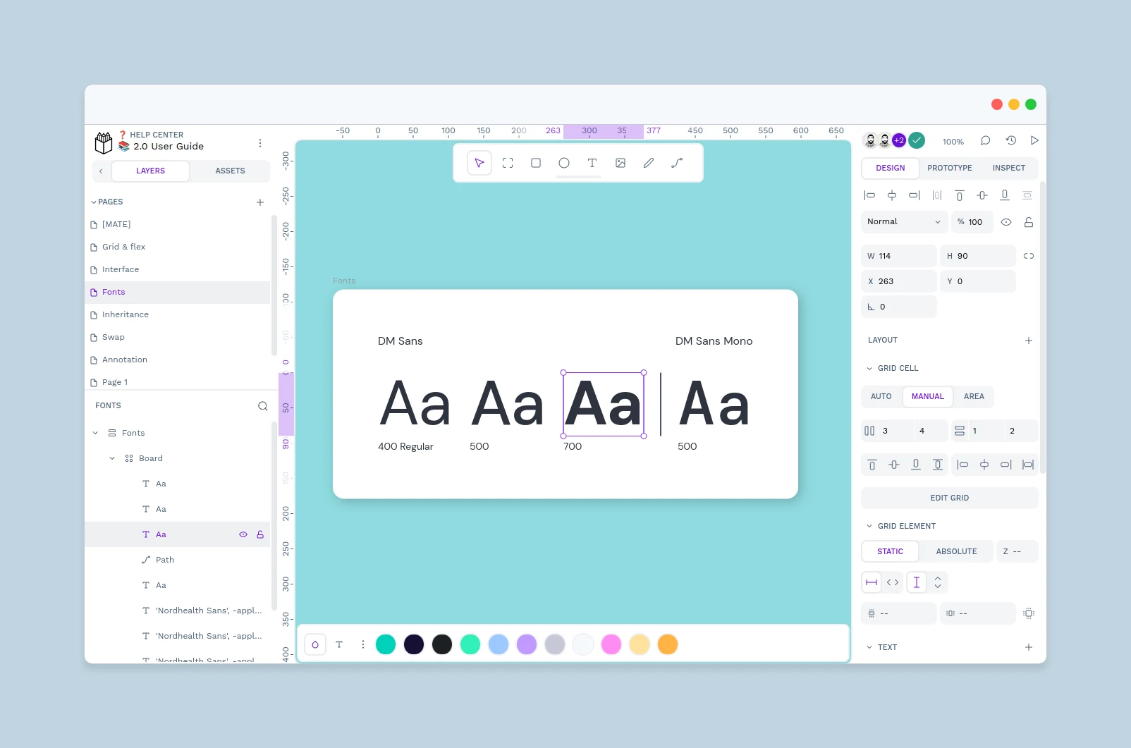
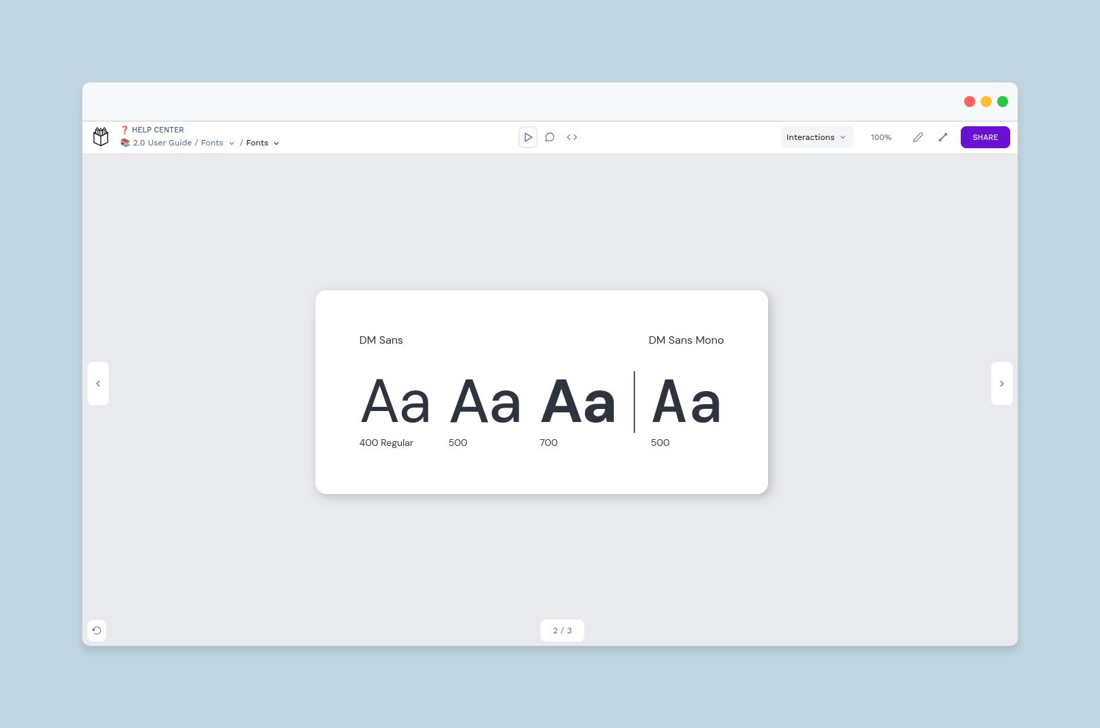
View mode
Launch the view mode to present and share your designs, comment on them and play with the interactions set at the workspace. You also have an Inspect mode where you can get properties specifications and code snippets. More about the View mode.
1) Pages selector 2) Boards selector 3) Play mode 4) Comments mode 5) Inspect mode 6) Interactions settings 7) Zoom options 8) Edit file 9) Full screen 10) Share prototype 11) Boards counter 12) Reset prototype 13) Navigation button
- Pages selector: Navigate through the pages of a file.
- Boards selector: Boards selector displays a list of the boards with thumbnails that provide a graphic overview of the file.
- Play mode: Default presentation mode where you can also play with interactions.
- Comments mode: Comments mode shows comments inside Boards and allows users to reply or add new ones.
- Inspect mode: At the Inspect mode you can get design specifications such as object properties, measurements and distances. You can also get code snippets for CSS styles, HTML and SVG. More about Inspect.
- Interactions settings: Select whether to highlight interactions active areas on click, all the time or not at all. More about interaction settings.
- Zoom: Zoom options and info about their shortcuts.
- Edit file: Opens file edition at the design workspace.
- Fullscreen mode: Activate or deactivate browser fullscreen mode.
- Share prototype: Create shareable links of the view mode to send it to developers, other designers or stakeholders, so they can view the designs and access the code specifications regardless of being at your team or even logged at Penpot.
- Boards counter: Boards count and current position.
- Reset prototype: Goes to the first board of the prototype.
- Navigation buttons: Forward and backwards buttons.
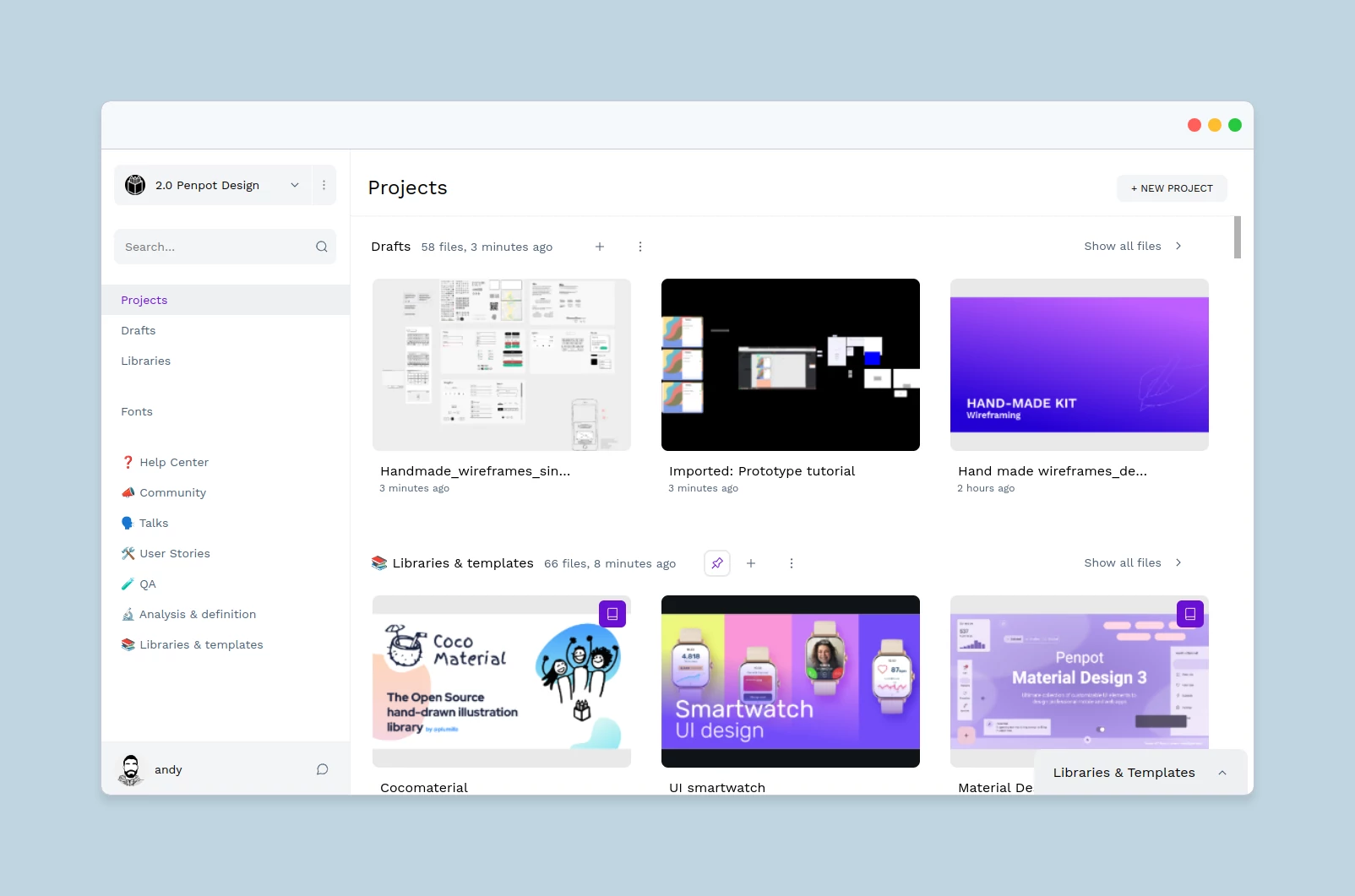
Dashboard
The Dashboard is the place where you will be able to organize your files, libraries, projects and teams.
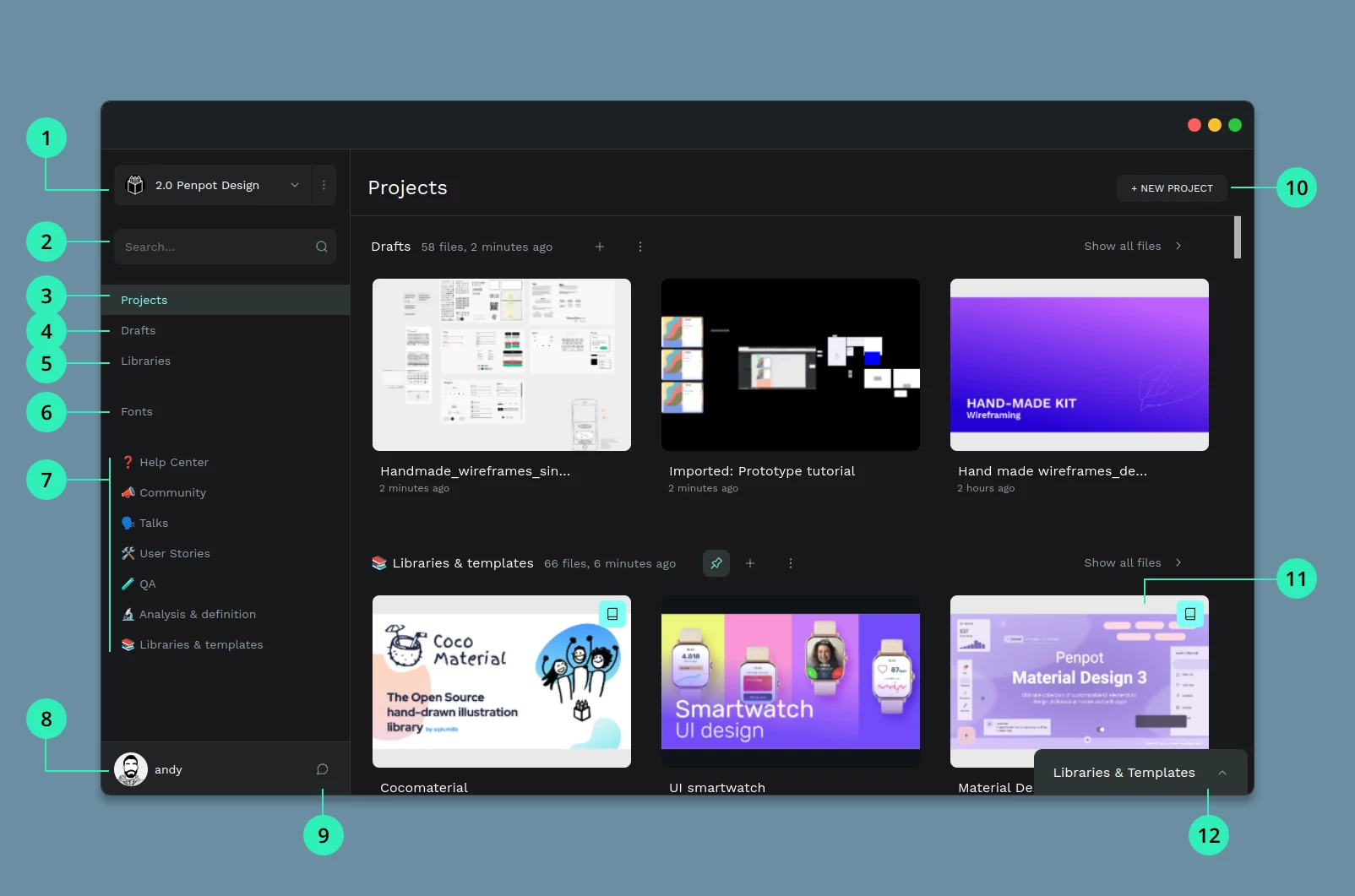
1) Teams 2) Search files 3) Projects 4) Drafts 5) Shared Libraries 6) Custom fonts 7) Pinned projects 8) User area 9) Comment notifications 10) Create project 11) File card 12) Libraries & Templates module
- Teams: A team allows you to collaborate with other Penpot users. Team members are allowed to work with any project or file within the team depending on their permissions. Members with admin permissions can also invite other members. Create or join as many teams as you need with different groups of people.
- Search: If you are looking for a specific file just type its title at the search box.
- Projects: A project allows you to group design files. It works pretty much like a folder in a file system. You can create as many projects as you need. If you are going to work with more people in a project, you should create it inside a team.
- Drafts: The drafts section is where you can find the design files that are not inside any project.
- Shared Libraries: In this section you will find all the design files that have been added as shared libraries. That way you will be able to better control the files that are sharing their assets.
- Custom fonts: If you have purchased or own personal fonts that are not included in the catalog provided by Penpot, you can upload them from your computer and use them across the files of a team.
- Pinned projects: If you want to keep some projects handy (for instance because you’re currently working on them) you can pin them to make them quickly available at the sidebar.
- User area: This must be you! Access your profile settings, Penpot tutorials, the Penpot Community and more. You can also find here a way to leave us feedback. We’d love to read your thoughts :)
- Comments notifications: Here you will be able to see if you have unread comments inside the files of the team. There's also a button to mark all notifications as read.
- Create project: Create as many projects as you need to organize your designs.
- File card: Basic information about a file at plain sight. A preview, update info or if it’s added as a Shared Library. From there you can perform several actions over the file (rename, duplicate, move, download, delete).
- Libraries & Templates module: A curated selection of Libraries & Templates files ready to import.
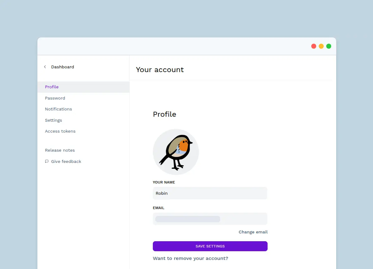
Your account
Your account settings can be changed at the user area, in Your account. Here you can make changes to your profile, password or account language, as well as generate personal access tokens and access release notes.
Profile #
If you want to change the email address associated to your account or remove your account entirely, this can be done in the Profile section.
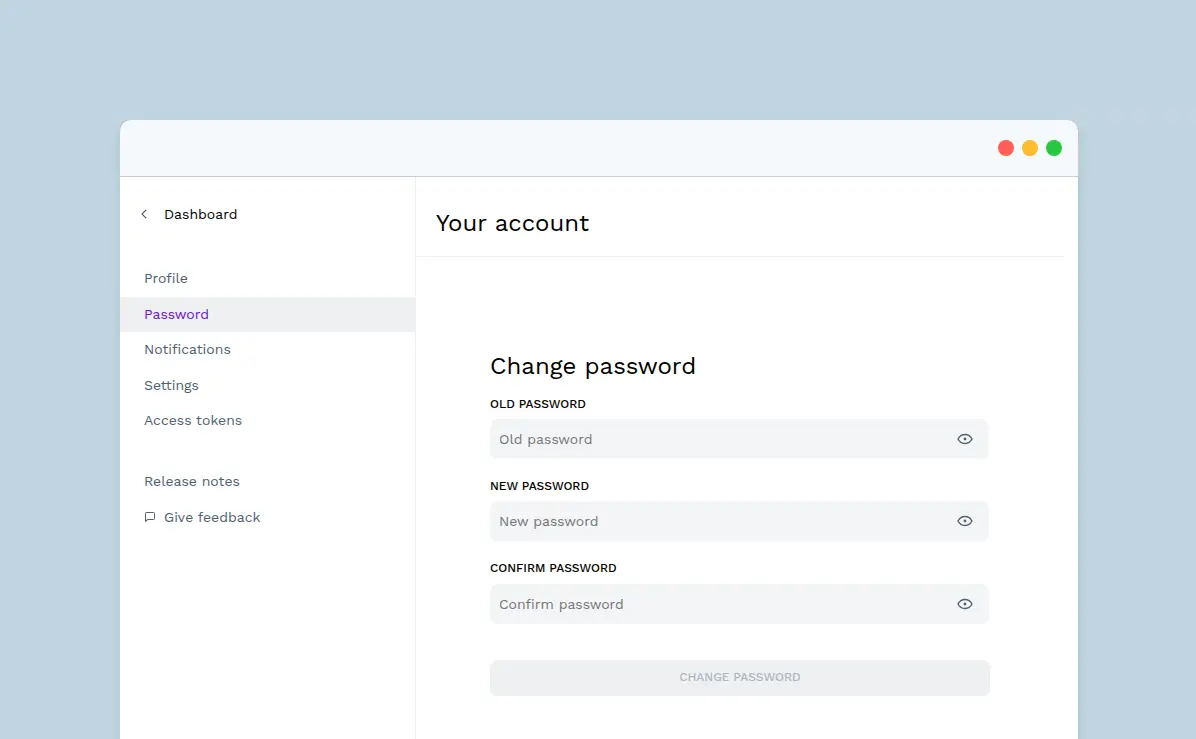
Password #
If you want to change your password to a new one, this can be done in the Password section.
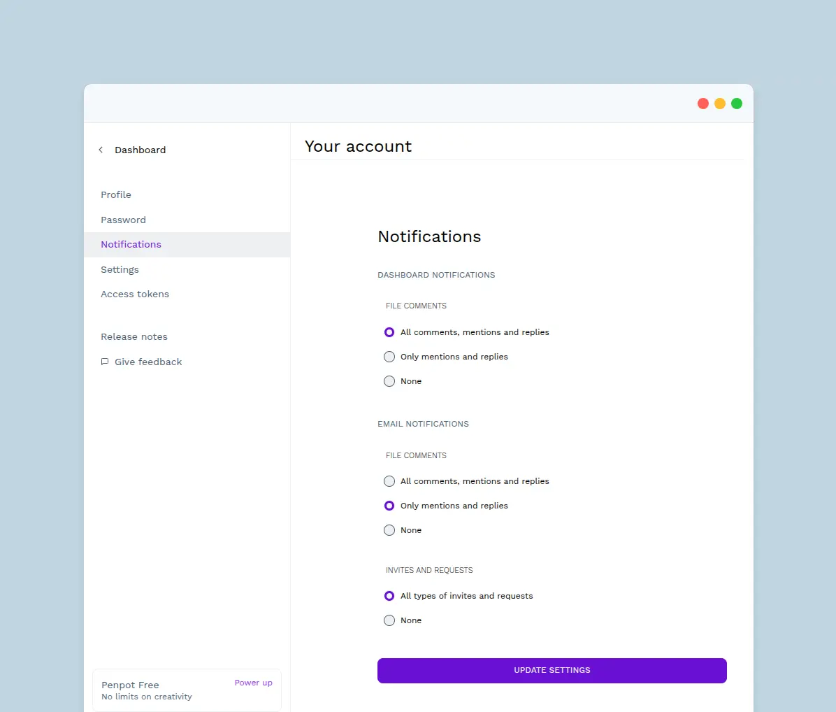
Notifications #
At the Notifications section you can configure the email and dashboard notifications.
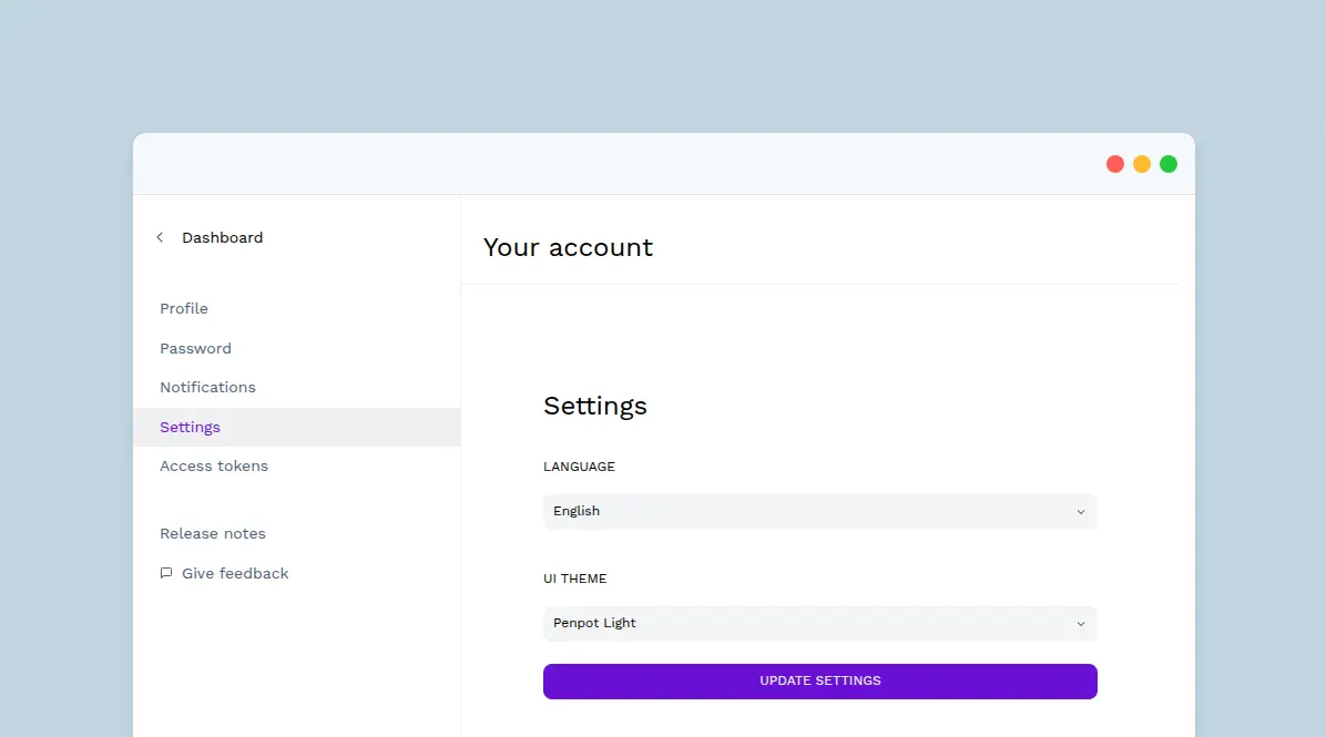
Settings #
At the Settings section you can change the language and the UI color theme.
Access tokens #
At the Asset tokens section you can manage your access tokens. Read more about access tokens here.
UI Theme
Penpot's default interface is dark but you can switch anytime to a light option. You have 2 ways to change the theme:
- From "Your account" > "Settings".
- Using the shortcut Alt/⌥ + M.